And, that's how “SafetyNet.” was born
Background :
Have you ever been in a situation where your personal safety has been at risk? An uncomfortable situation from which you desperately needed to get out of, or perhaps having to pass through a creepy neighborhood which you couldn’t do anything but feel suspicious about?
or, have you ever been in a situation where your loved one’s safety has seemed to be at risk? A dreaded situation where anxiousness and panic sets in, as in untimely circumstances, the whereabouts and frequency of contact with them gets alarmingly thin and you don’t have any idea what to do ?
Is your answer a no?
Good for you, I hope you and your loved ones always remain safe in today’s times. But, unfortunately a huge chunk of the population nowadays either fear or are victims to first hand exposure to risks related to personal safety making it a growing concern worldwide, especially in India, in particular.
USP
Design Process
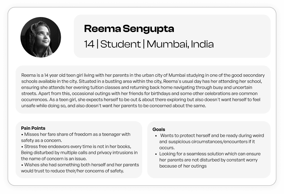
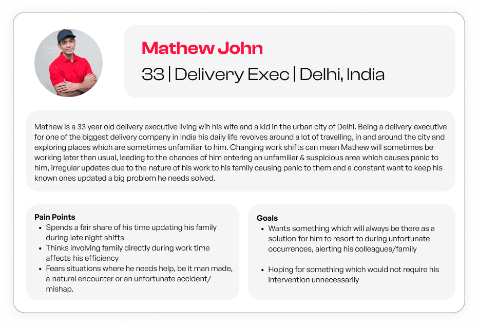
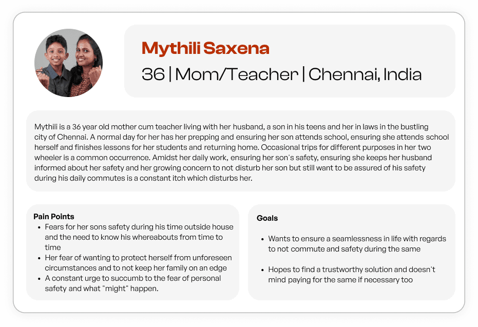
User Personas
Ensuring that most part of this solution is free to use, at least until the users know what the service is to provide them with and users get their right to get familiar and understand if this solution is for them.
Understanding the importance of inclusion of updated technological solutions - E.g. : “LetsTrack” Tag tracking, Crash Detection, One Touch SOS etc. to ensure a better and cohesive safety solution unlike other solutions to this problem.
Users of all age, sex and communities will benefit from this effort to ensure that keeping track of the safety of anyone, be it a kid, a working professional, a woman during unsafe situations or even one’s parents… will be accessible and instill a sense of assurance.
To view the “research” and “define” stage with deep information to what all went behind arriving to the conclusions related to design & user experience of this application click here ↗
If you are into understanding the why's/ hows behind this project, I urge you to read the first two stages & come back here to continue from the ideation stage !
(This includes the stages of research, prioritization matrix, affinity mapping & empathy mapping, user flow chart, info arch and more)
Working prototype
The Homepage 🏠
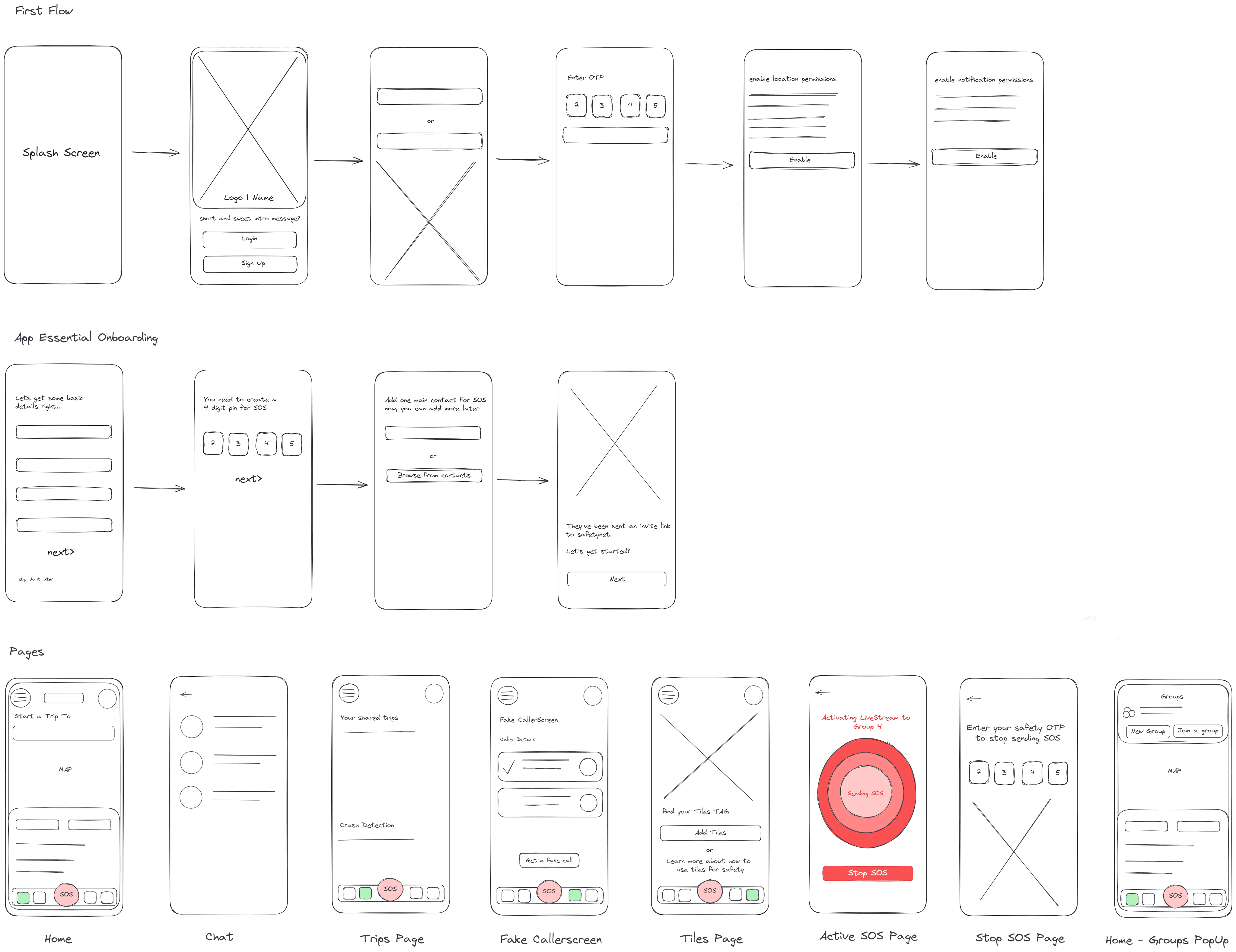
Wireframes
Branding :
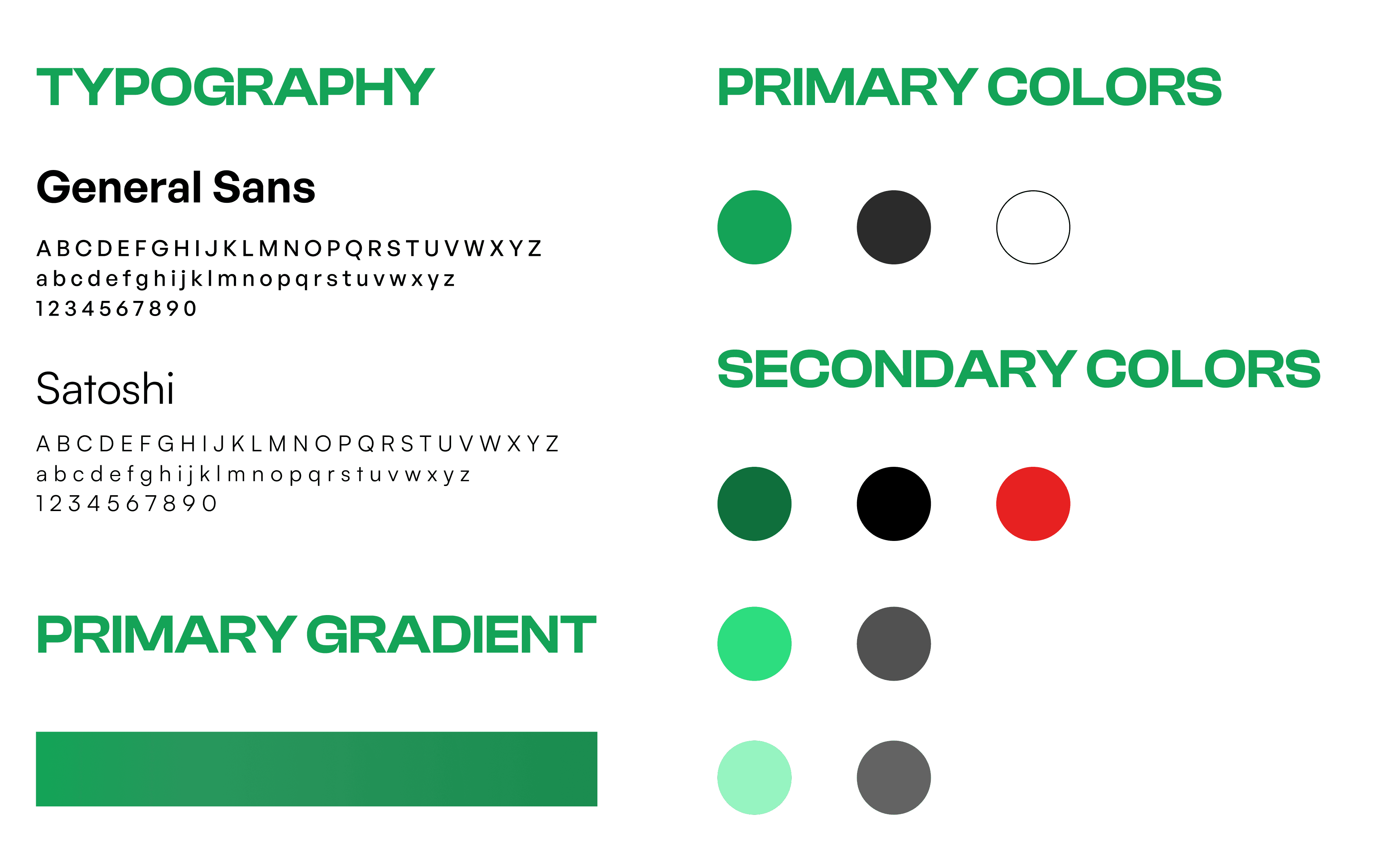
Style Guide :
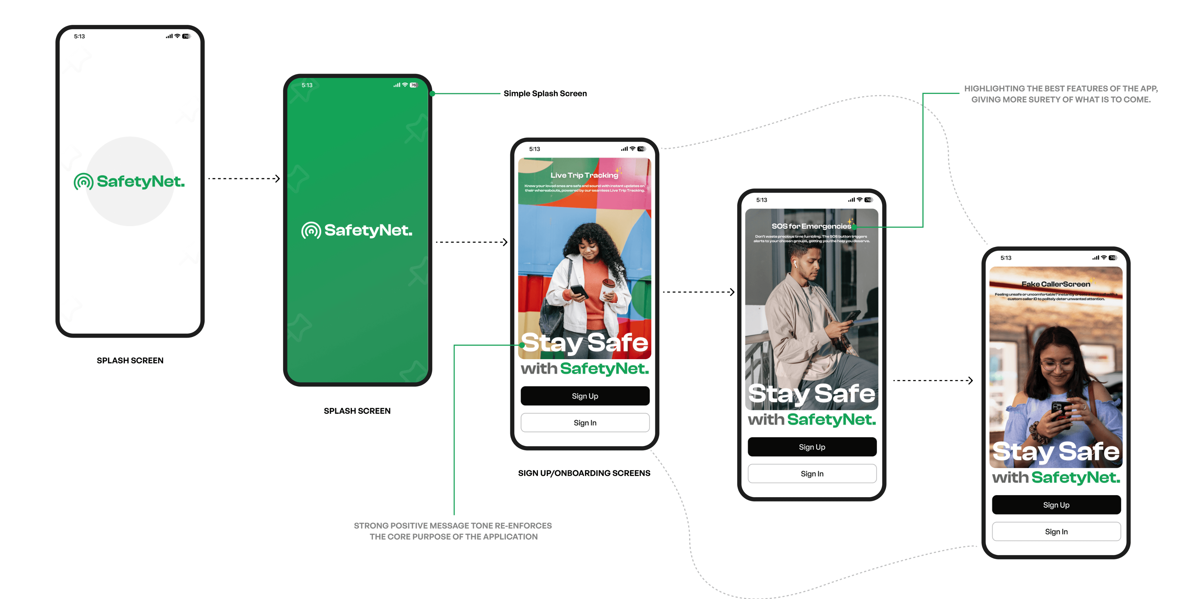
The entire app essential onboarding flow along with auth pages concentrates
on overcoming the problem of unclear onboarding experience in
competition apps & also presenting the user with a pleasant experience to get
to the actual reward - The application’s pages.
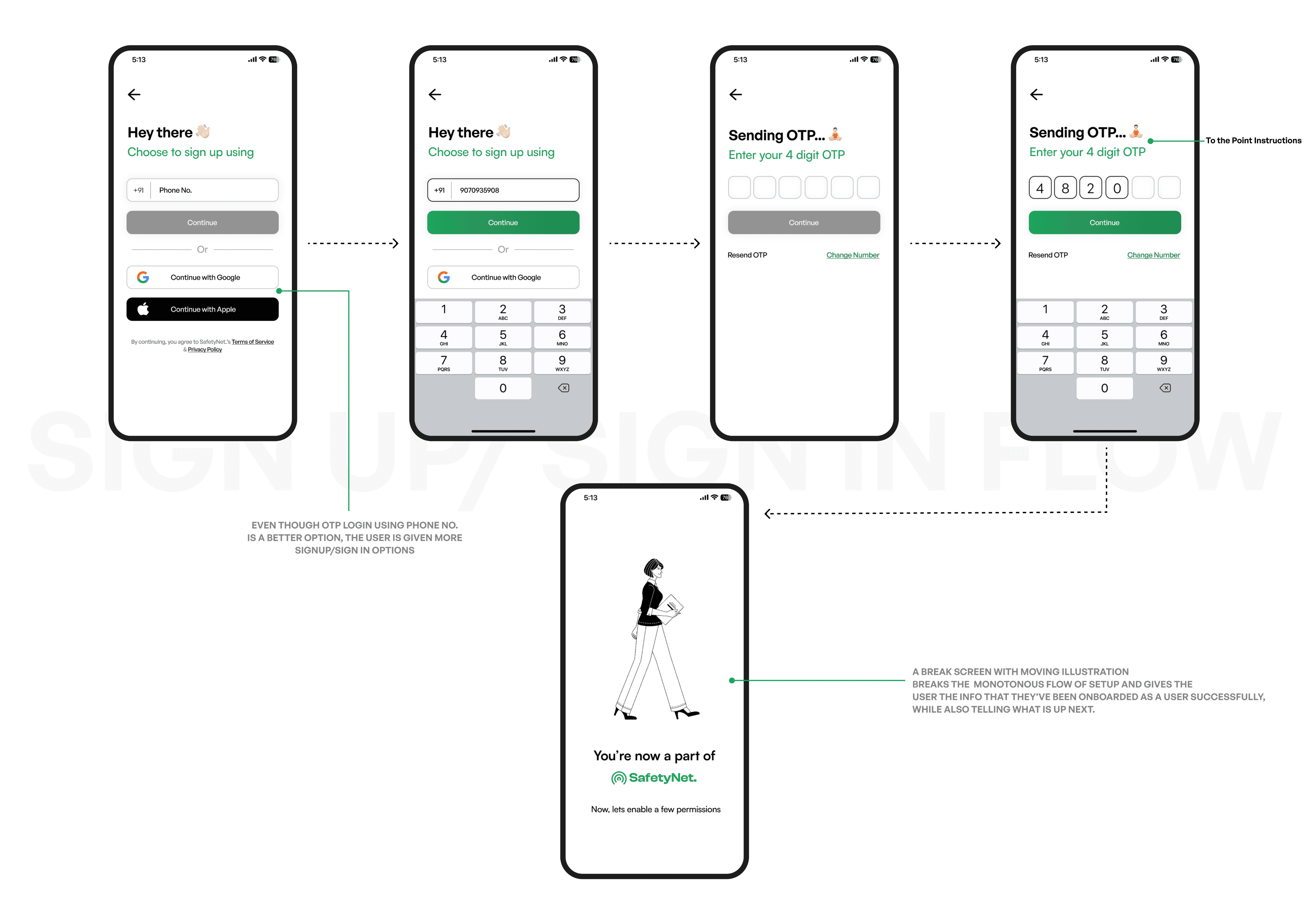
Authentication | Signup/Sign In
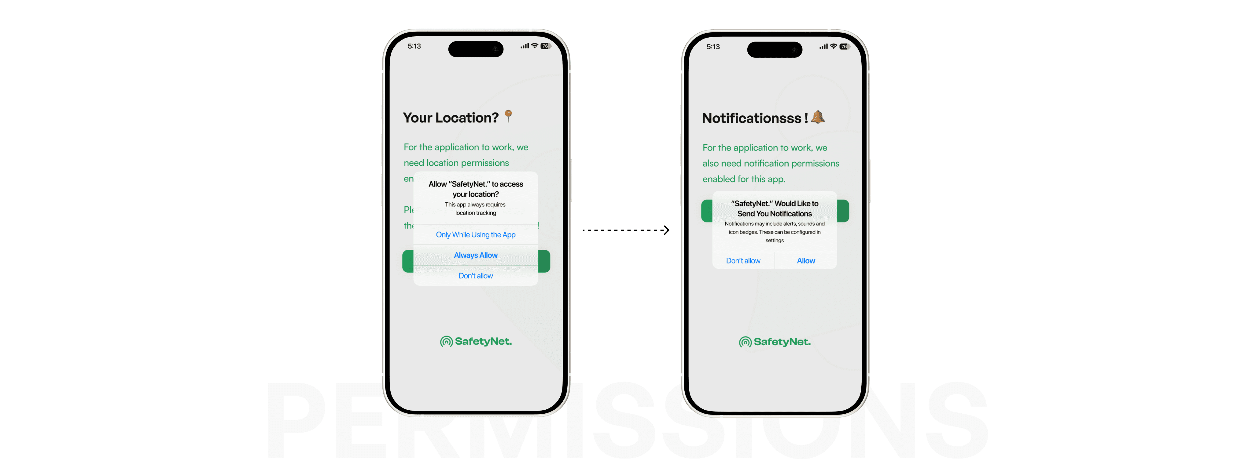
Permissions.
Since this particular app deals with location services and enablement of being in contact constantly with loved ones, enabling permissions becomes an essential part which is needed by DEFAULT. To let the users understand the same, the following screens takes care of the same, thus covering the pain point of miscommunication in other apps.
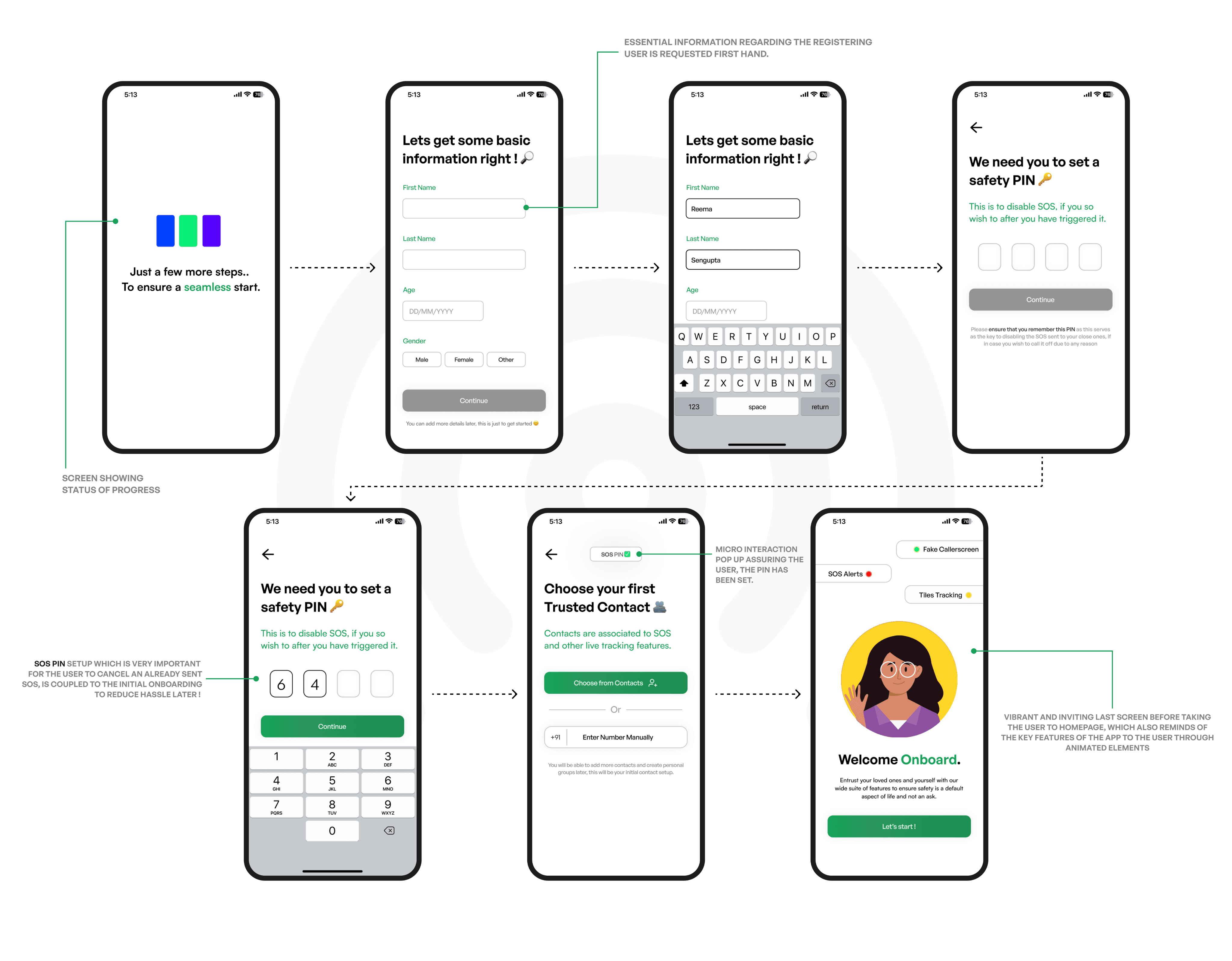
App Essential Onboarding 🚗
To ensure the users finish with a well thought out onboarding experience, the next set of screens concentrate on collecting and providing essential information from the user, which :
Ensures that the user is familiarized to what is to be kept in mind for later
Ensures that the most important information about the user is taken first hand to cater better to their needs.
The Live Trips page 🚝
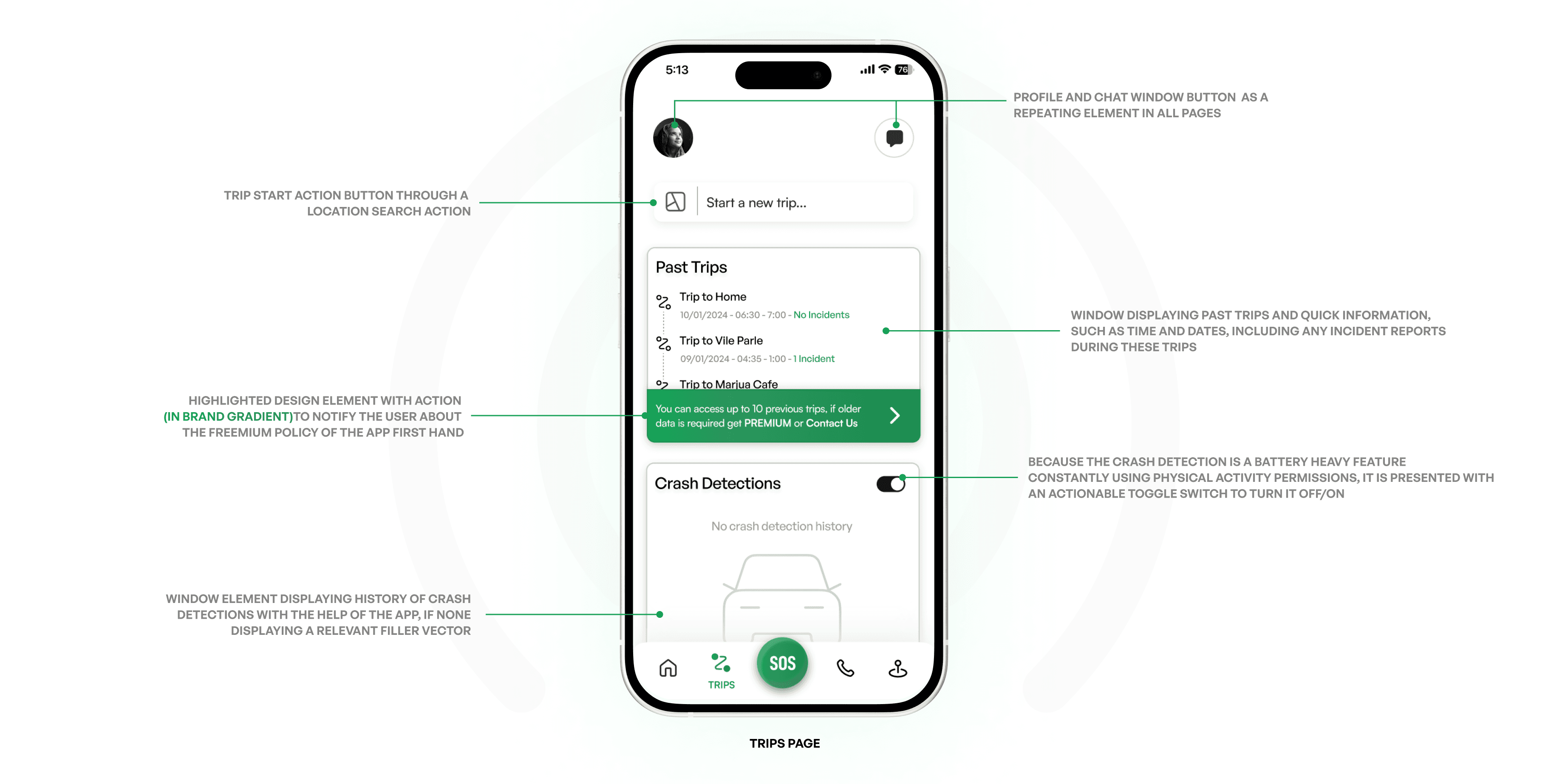
The next important screen after the home screen has to be the live trips page in the application. This screen encompasses the action of starting a trip, viewing past trips and also taking action on crash detection data. To ensure this page doesn’t confuse or put the user in a tough place to understand the page, it was designed to reflect easy understanding.
This topic of personal safety kept lingering in my mind…
And eventually, this key pain point I had discovered, led me to think about a possible solution which could help everybody and why there was no such solution with a high retention and trust rate yet ?
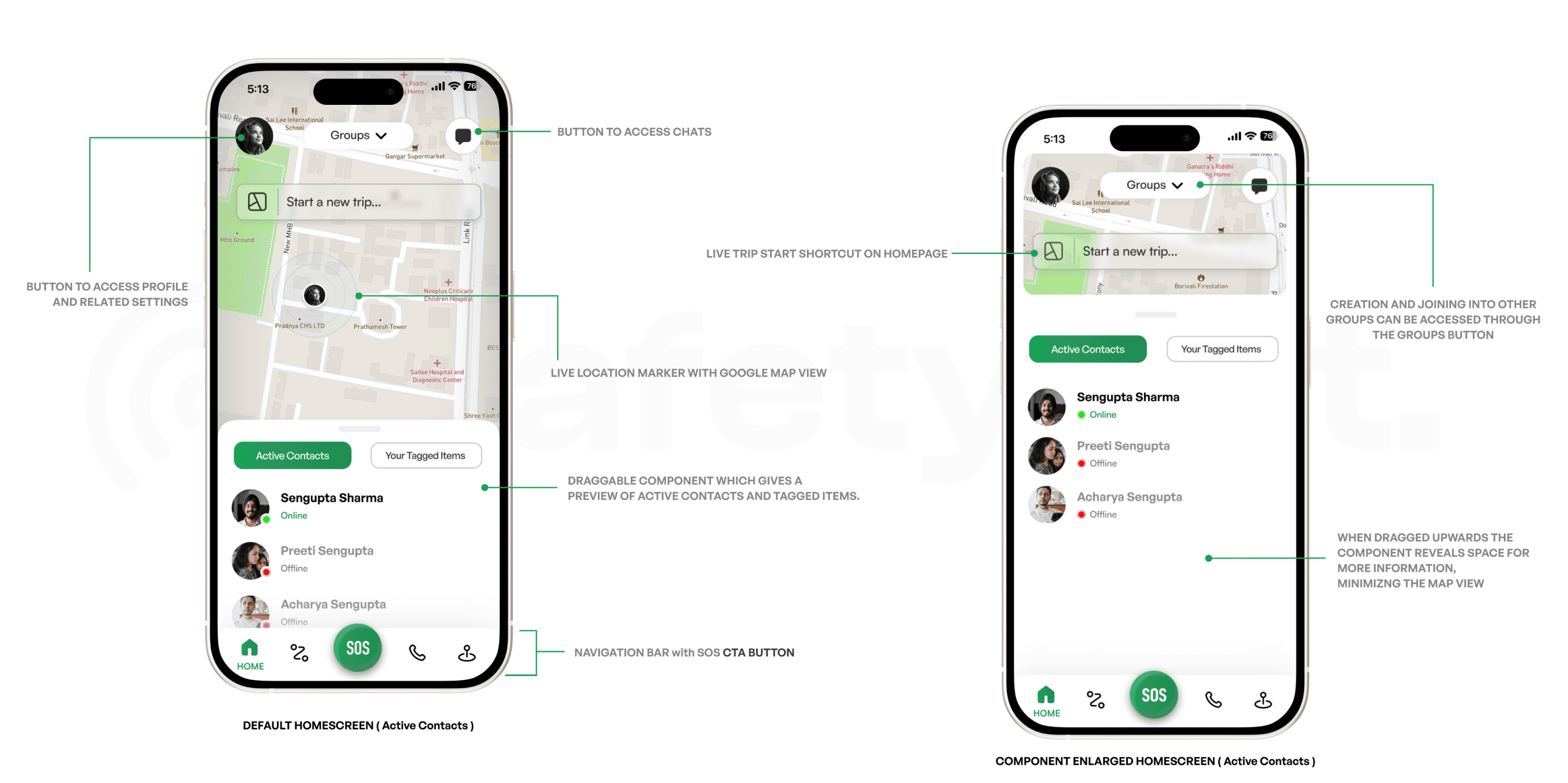
The designing of the homepage was conceived from the start, to be a screen which would essentially be the most accessible and practical part of the entire application. It was in my mind to also not overdo the design, leaving the users confused like in most competitor applications. In the end, the homepage stays true to all that by :
Having an accessible navigation bar with the SOS button being a highlighted CTA Button
Using a draggable component which encompasses a section with quick view to which contacts are active on the app and a section to also quickly view tagged items
Showing range of 3 buttons on the top which all provide access to each area of use respectively ; Profile, Groups and Chats
Enabling a search bar which acts a shortcut to immediately start a trip from the homepage itself
Displaying a map screen behind all this which has an active location tracker giving the user idea towards current location and if a trip is running, the active trip tracking route.
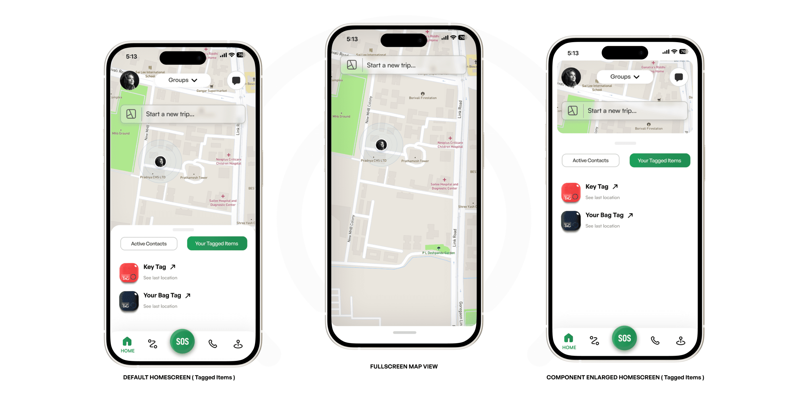
This home screen also has the same functions when switched to the “Your Tagged Items” section and dragging down on the map reveals a full screen map view as follows :
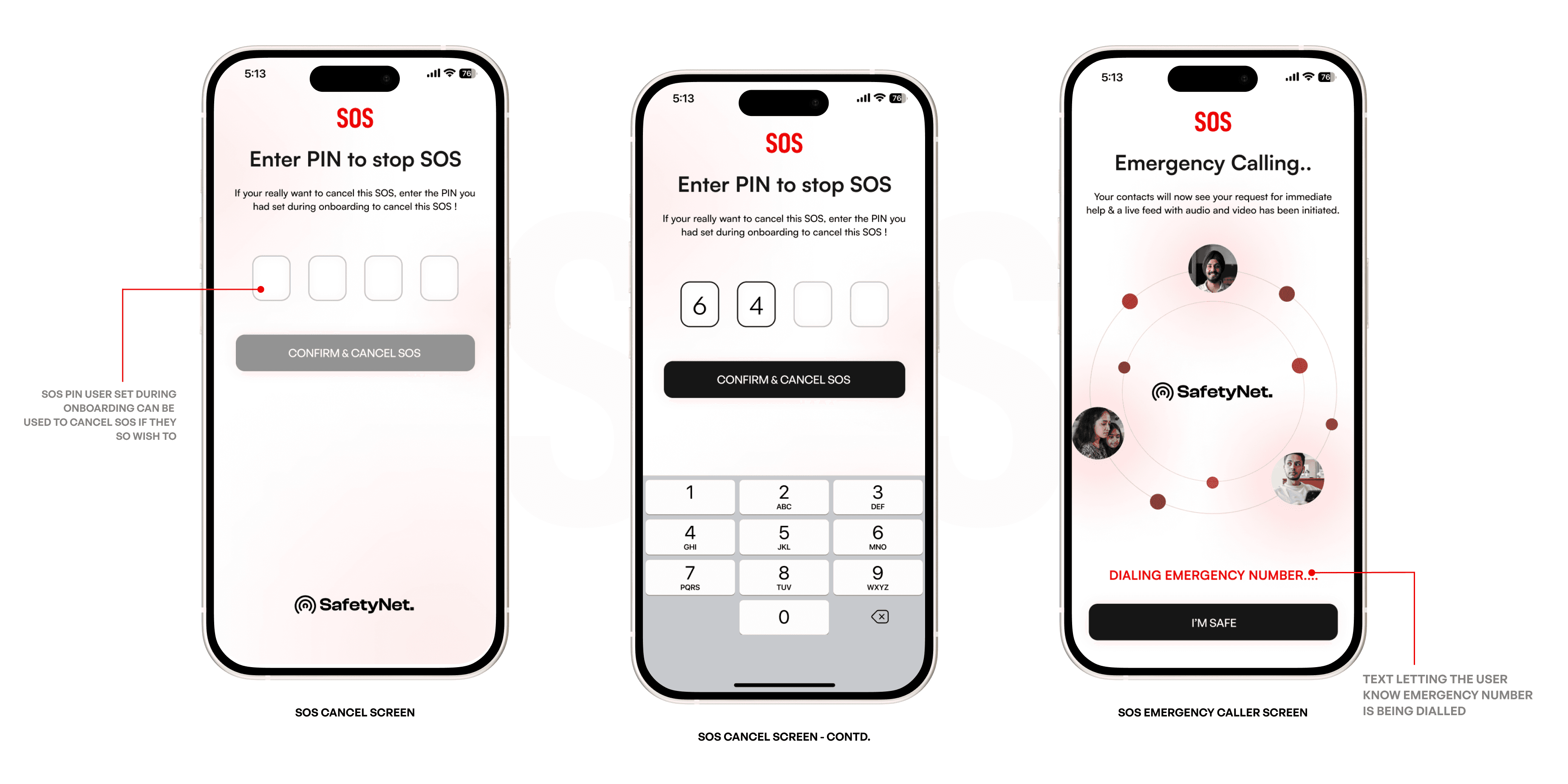
The SOS Page 🚨
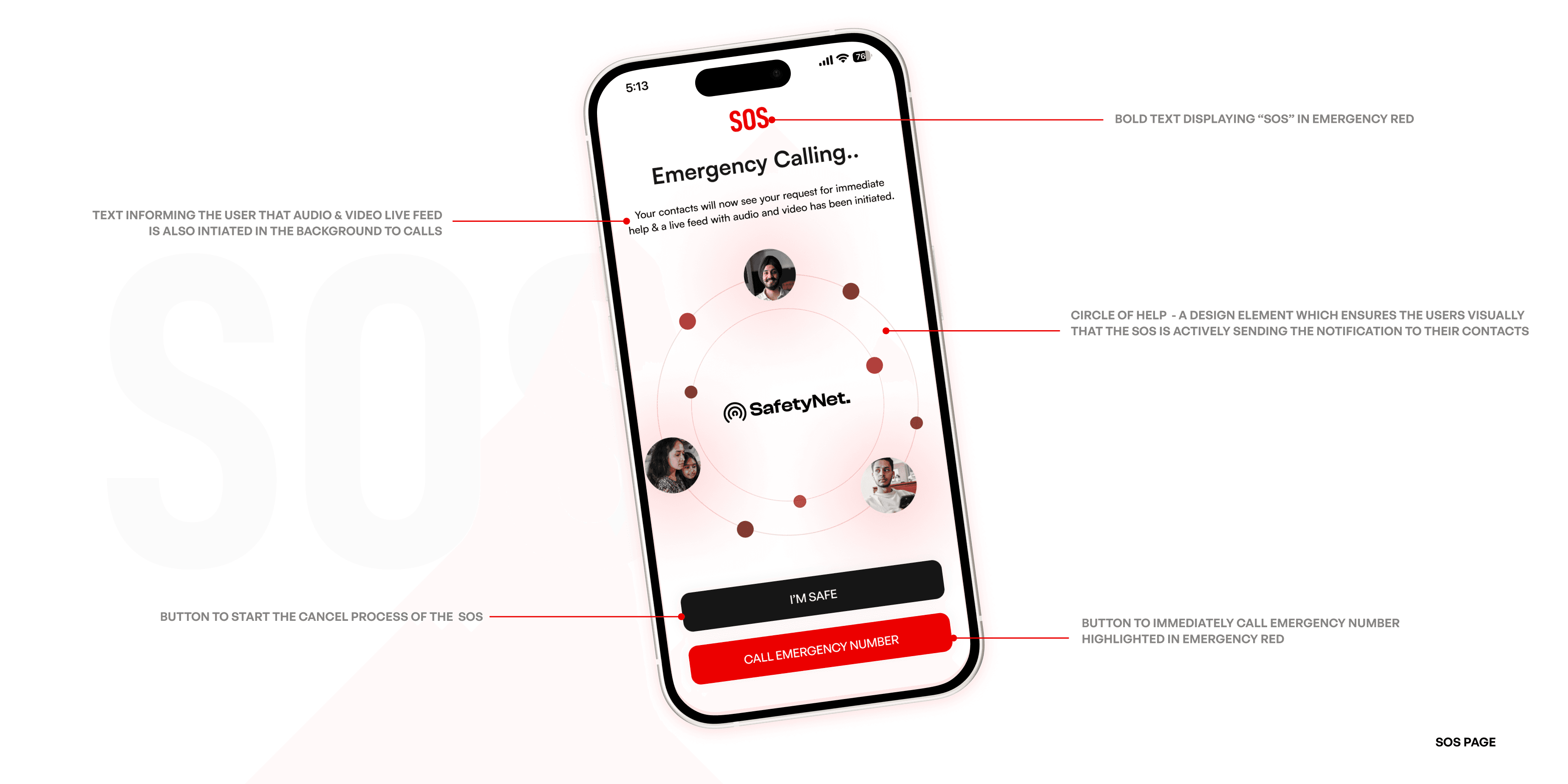
The SOS Page is the key screen in the application. Thus, designing the same had to involve keeping the user in mind. The placement of elements, colors and design choices reflect visual communication because of the situation a user would eventually be in this page for.
During uncertain times after entering the SOS Page, the user would probably only have quick glances, thus conveying information through right visuals and colors meant saving time and the user’s safety.
The flow to either cancel the SOS or call emergency number from the initial screen goes this way :
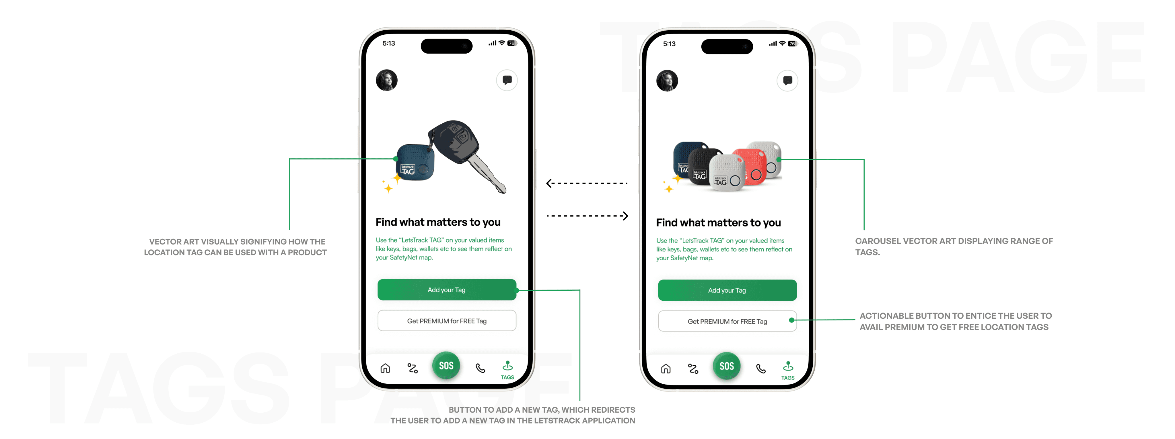
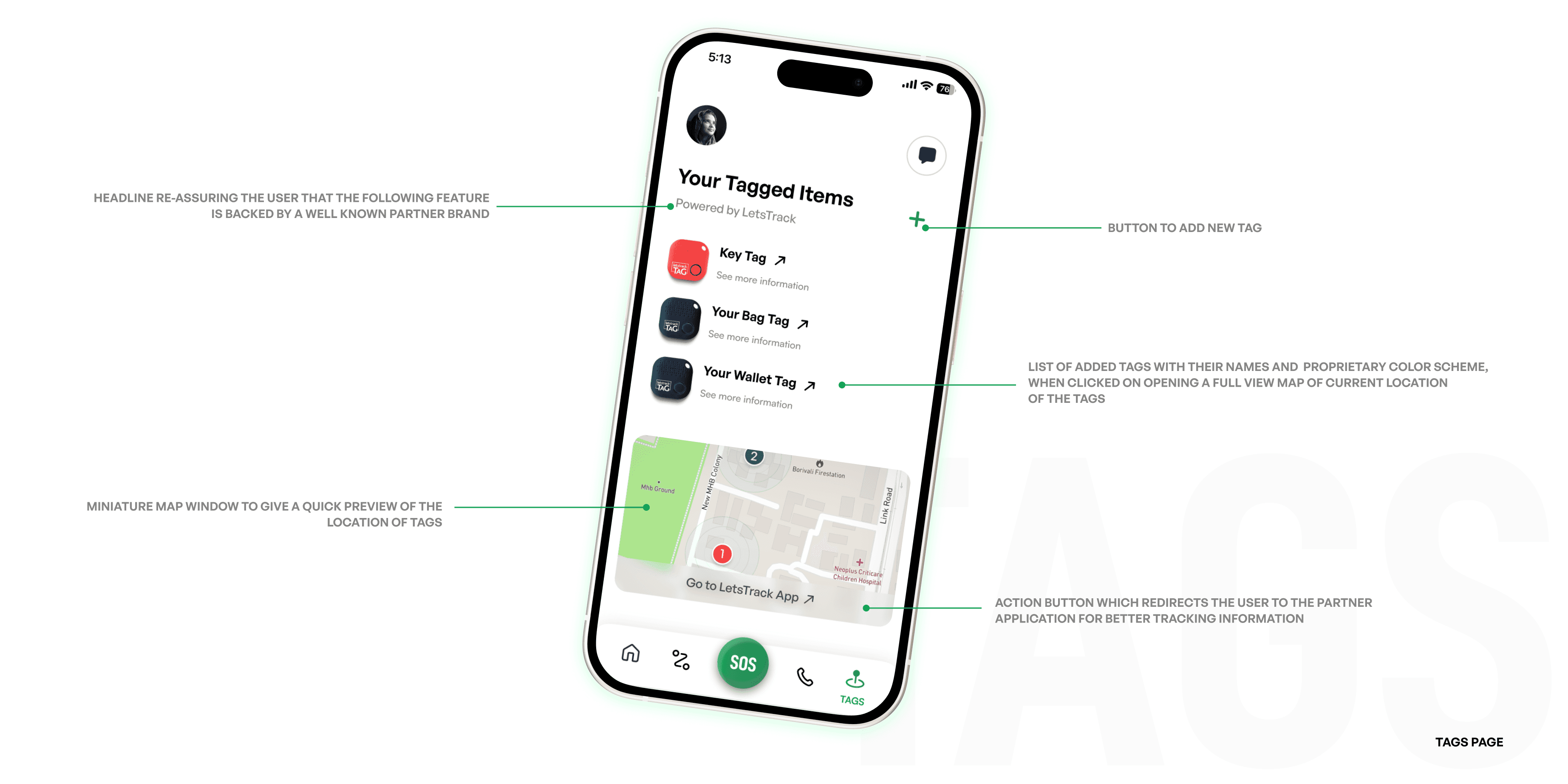
The Tags Page 🏷️
The tags page in the application is the one which deals with helping the user add location tracking tags to any of their belongings and track the location of the same.\
Leveraging the aspect of having a home grown brand from India called “LetsTrack” (who specialize in providing location tracker tags at an affordable rate with their own application to track the same)
Collaborating with such a brand would prove very useful when the users can add tags which would reflect in their “SafetyNet.” map inside this particular page, thus truly expanding the horizon of this application being a one stop solution for all users.
A first time user to the app, is greeted with the following screen:
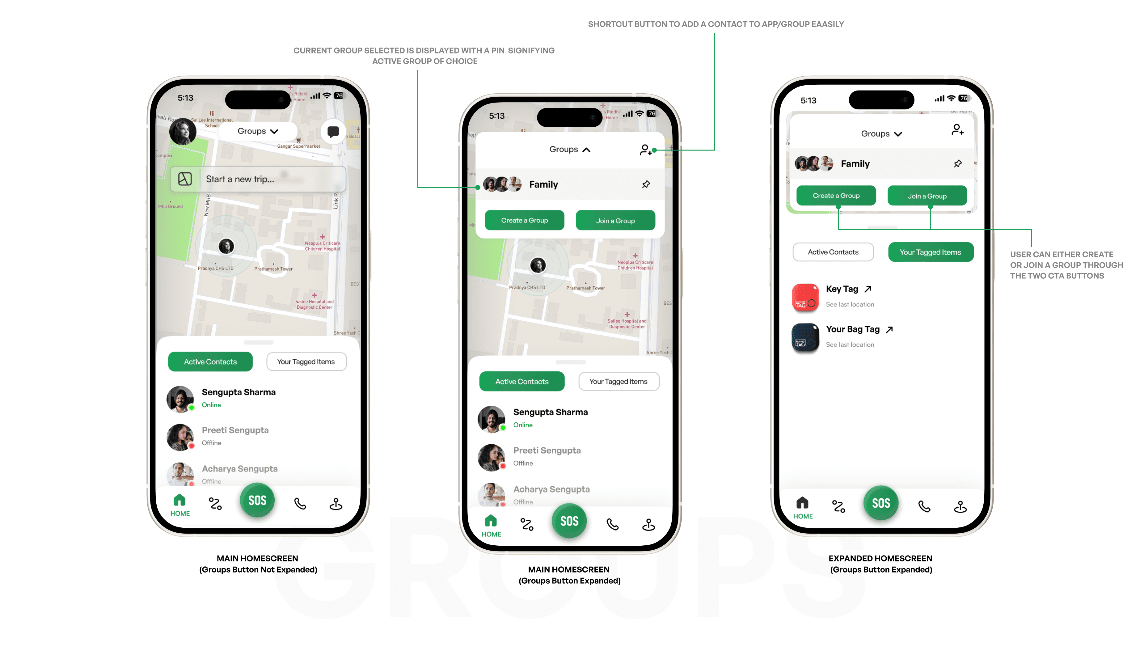
The Groups Feature 🫂
Before we look at the last page in the navigation bar, lets take a detour and talk about - Groups. The idea of creating groups in the app is pretty simple. It provides the user with the ability to create multiple groups as per their choice or even join other groups created by other loved ones or friends.
This feature, then enables the user to share their live trips, crash detection notification or even SOS to their group of choice as per need and also enables the user to add themselves to other groups which they'd like to be a part of.
The feature of creation and adding oneself to groups is available on the home screen as a button on the top.
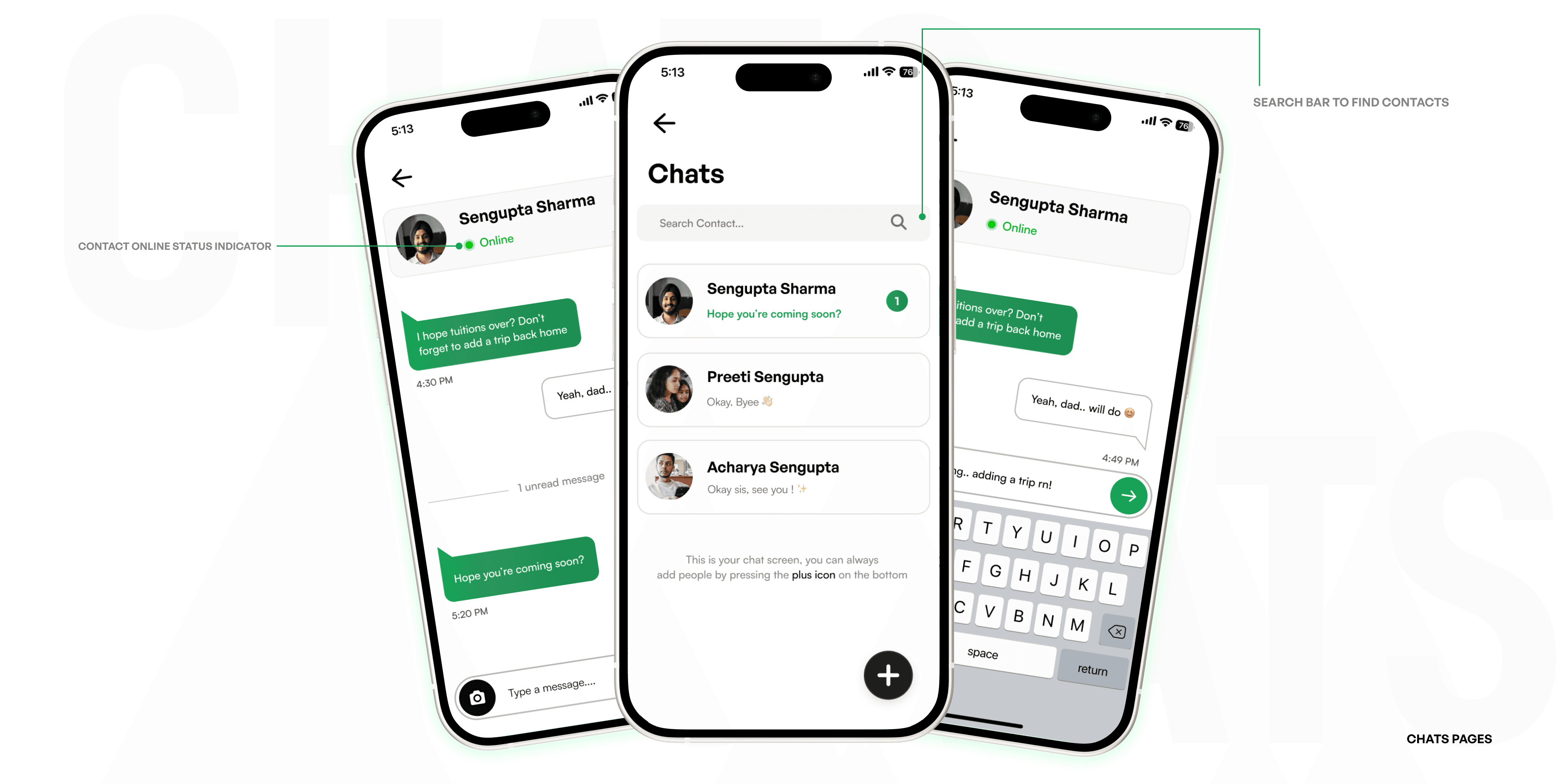
The Chats Page 🗨️
Apart from the main unique features of the application, the aspect of this application having an inbuilt chats feature is an essential plus point for users to make better use of this application.
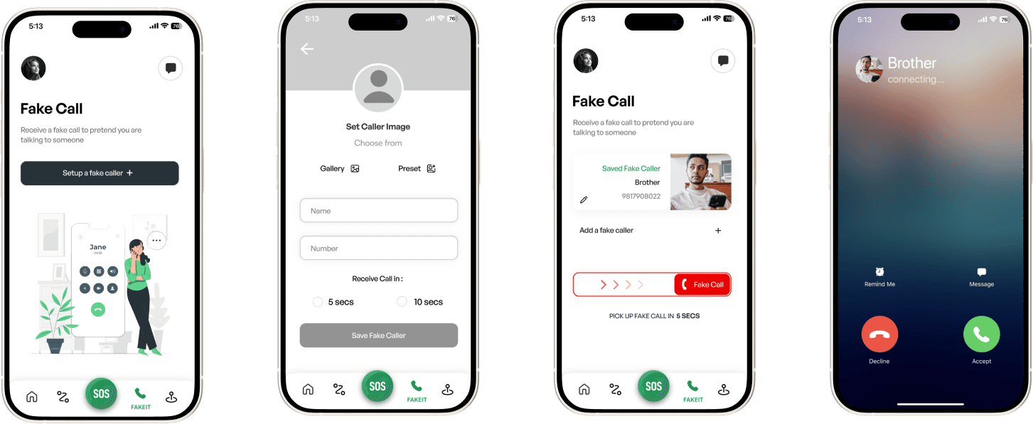
The Fake Caller Screen Page ☎️
The last page specifically accessible from the navigation bar is the fake caller screen page, this page has a singular purpose of providing the user with the option to receive a fake call to get out of uncomfortable/awkward situations which need some external intervention to break from that conversation or situation.
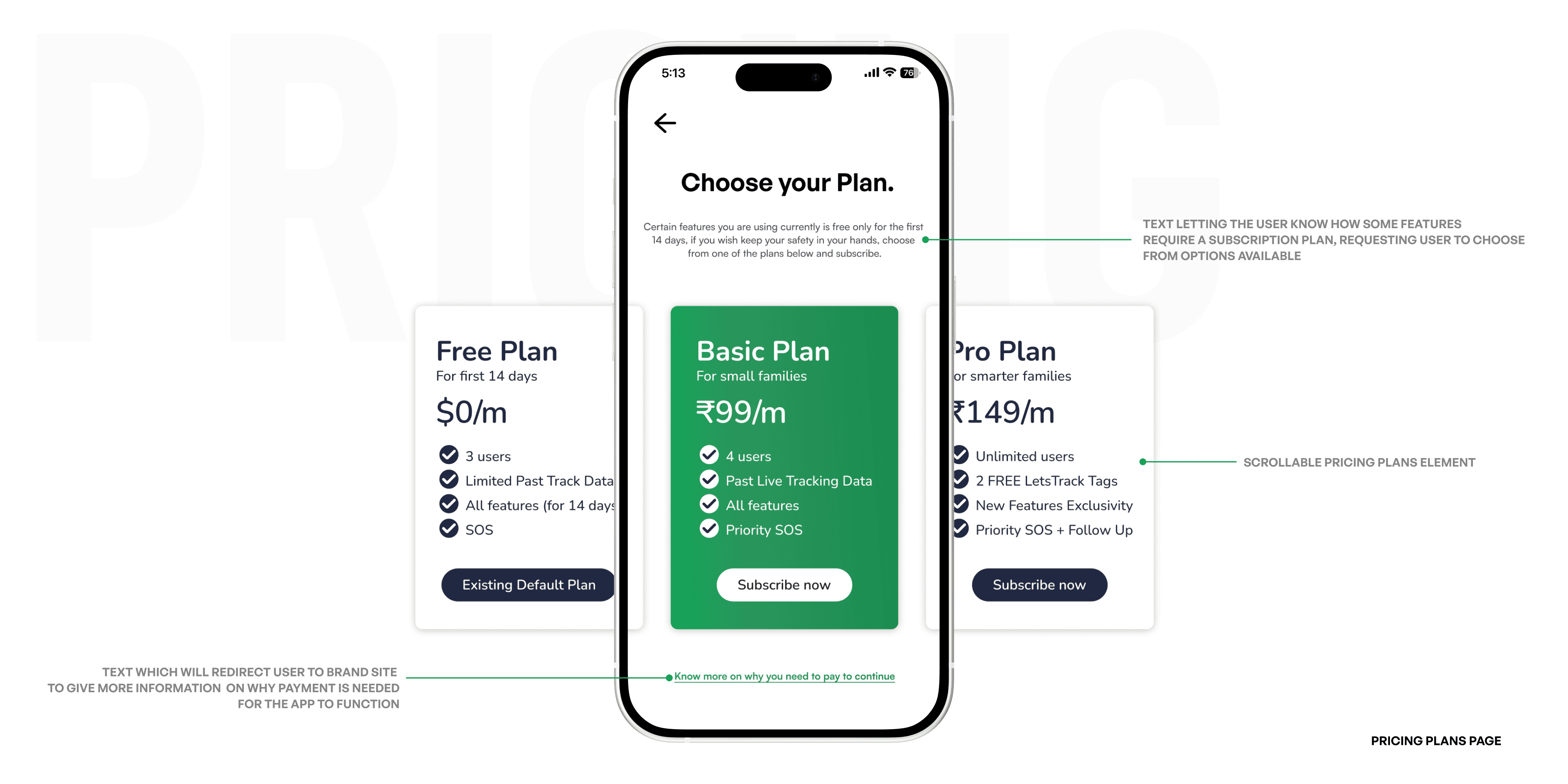
Pricing Plans Flow 💵
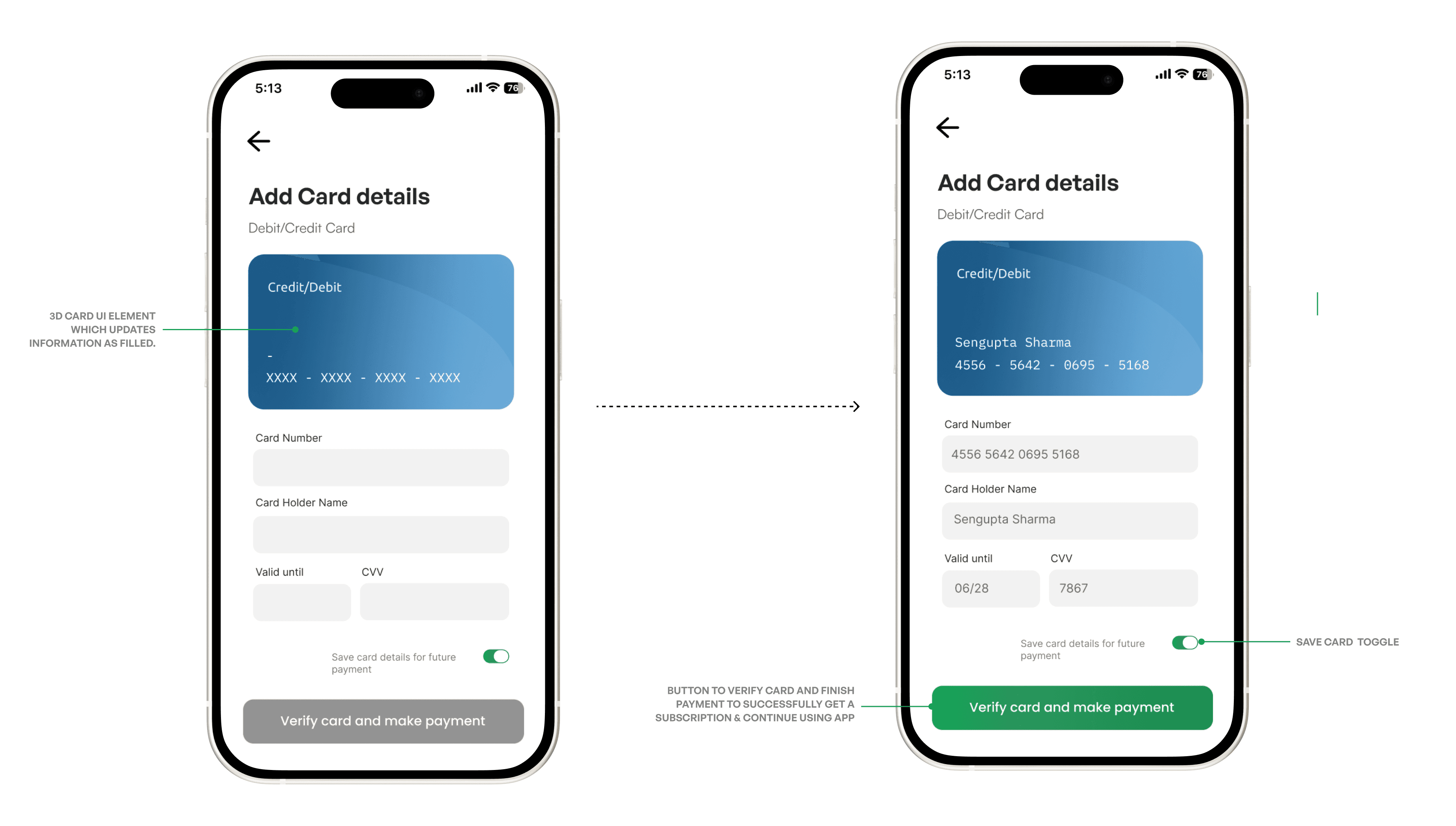
Subsequent Card Payment Page
Once the user has taken the decision to add a location tracker tag to their map, the user is redirected to the “LetsTrack” app to primarily add the Tag in the partner’s application first and once that is done, the user is redirected back.
Test 🧪️
For testing purpose, the working prototype of this app was given to multiple users in different age windows and unanimously the feedback was as below :
Positive Feedbacks :
> 85% of the users informed that the application has an immediately graspable user experience
> Most of the users also felt that the app has a welcoming yet simple user interface
> 60% of the users saw the integration of modern ideas seen as a welcome change
> Almost 95% of the users reviewed the home screen as an almost perfect experience to access important elements.
Need to Improve on :
> A part of the users felt the need to reduce whitespace in a few screens and improve the interface of the app to be a bit more “fuller”, major question faced “How much simple, is too simple?”
> 70% of the users felt the need for increase in color variations aside of primary and secondary colors
> 50% of the users wanted all of the “add+” toggles to be more legible and better made
> A fair chunk of the users felt the “Live Trips” location search bar needs improvement overall and also felt the need to switch the button placements in the SOS screen to make emergency number dialing the first CTA button instead of the I’m safe button
Key Takeaways for me :
As a task intensive case study work, this first project of mine required me to do most of the work by myself, this enabled me to understand multiple facets of the role played by a product designer in a larger spectrum, giving me the idea to what needs to be focused on better the next time.
Even though the UI designing has received rave reviews on being very practical and striking, I presume the need to keep developing my UI Design skills to catchup and implement more in trend design thinking towards my work.
User Experience as a concept is an ocean of information and theoretical knowledge to study on, while my growing knowledge has given me enough to implement on my first case study project, continuously improving my knowledge on UX should be a constant pursuit to be better as a designer.
Testing as a step can be iterative. Going forward, developing a habit of testing after every step of the design process can prove better by letting me/ a team I’d be a part of know what needs to be corrected and worked on immediately, rather than being worked on in the extreme end leg of the process.

