Background
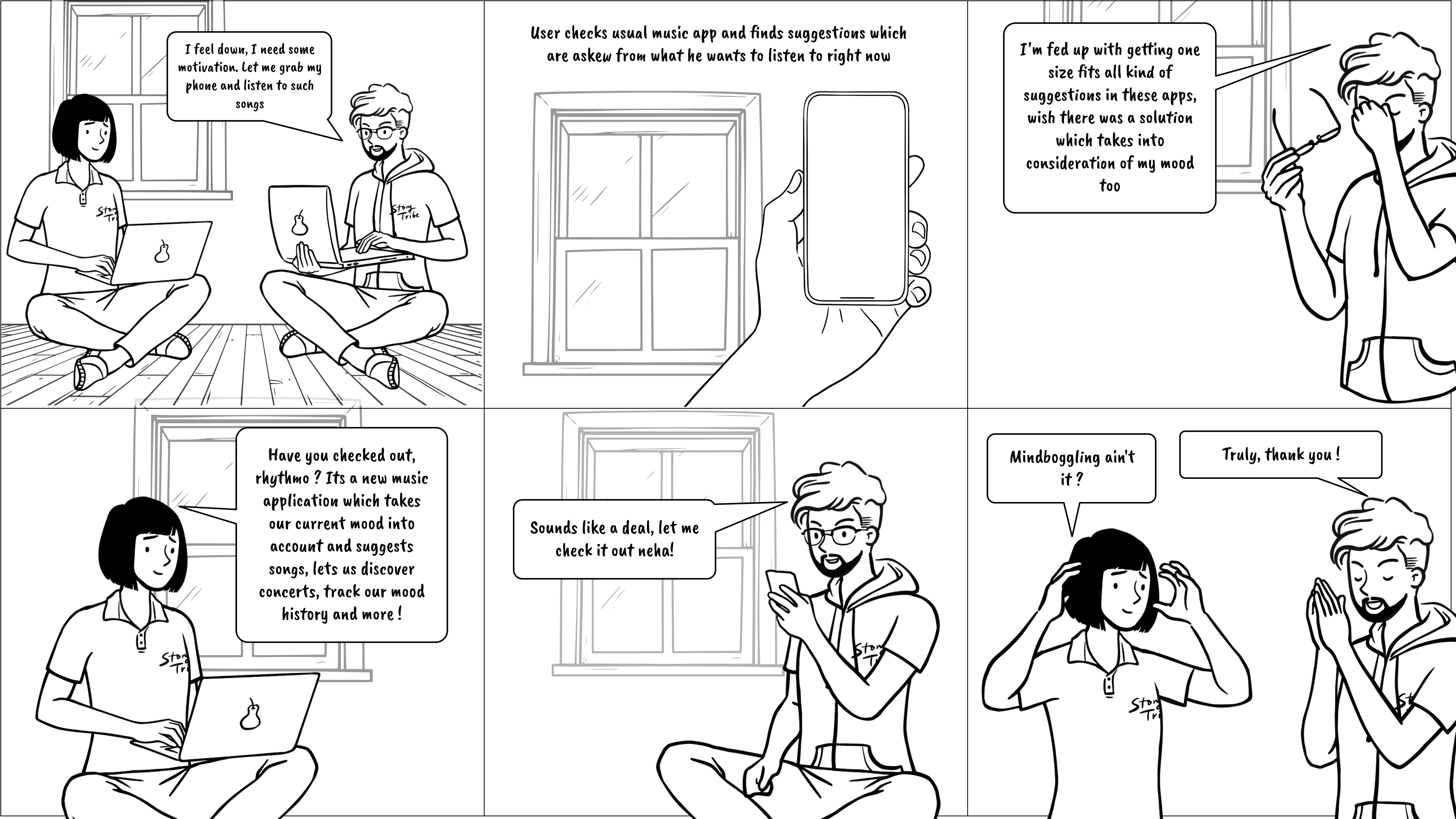
Been in a situation where your current mood and the songs you’re being suggested don’t match?
If yes, how do you see the idea of a music application which also takes your current mood and the change you want into account and suggest songs according to that ? What if the application also allowed you to track your mood over time, fix your recommendations and more ?
Problem Statement
Mainstream music platforms fail to account for users fluctuating moods/current situation when suggesting music. This often leads to disappointment as the recommendations don't match the user's current mood.
Users want more granular control over recommendations and to track their musical preferences over time. They also wish to know how their mood has been over time to take control of their mental health and also see other features make use of this addition.
Problem Context ?
Before we dive deep, let me put down a few points which will help us understand the context of this problem better:
User Expectations: Users expect music platforms to understand their preferences and mood based on the context of their usage. When this expectation is not met, it results in dissatisfaction.
Desire for Control: Users express a desire for more granular control over the recommendation process. They want tools to influence or fine-tune the recommendations according to their preferences and mood and also use the same learning to help them solve other problems.
Discrepancy Between Expectation & Reality: Users anticipate that the recommended playlists will align with their current mood or activity. When the recommendations fall short, it creates a gap between what they expect and what they receive.
Personal Mental Health: Vague music suggestions pushing the mental health of users into a ride of uncertainty by not understanding what kind of music might help at the moment, is a growing gap users sense but are used to it by this point.
Long-term Engagement: Users are interested in tracking their music listening behavior over time. They seek features that allow them to observe patterns, discover new music aligned with their evolving tastes, and revisit easily.
Primary Research
For the primary research of this particular case study, I set out to survey a data set of people from varying age & music listening habits through a survey with open, mildly-close ended and multiple choice questions to accurately understand the ground reality to what actual potential users of this app think about such an idea. Apart from the survey, I also conducted one to one interviews with a few close friends with unbiased opinions.
What did I find?
What uncovered from initial research was nothing short of an amusement to me. Being a person who is tech savvy and also a music lover, I always had wished to see a similar idea to be brought to life, but only after my primary research did I understand that more than 80% of the respondents interviewed wished for the same too ! This meant the problem was real, but a viable solution is a tough output to uncover.
What are the Key Challenges in today’s music discovery applications which I could presume from my research ?
Secondary Research
Apart from the primary research which involved real time data collection, I put on my thinking hat to work out a few things on the desk to ensure I am on the right track in terms of understanding the main pain points. Here are some of the questions I asked myself as I continued researching relevant answers for the same.
• What are the prevailing trends in music consumption habits, including preferred genres, artist discovery methods, and platform usage?
• What are the strengths and weaknesses of existing platforms in terms of user experience, interface design, and recommendation accuracy?
• What is the significance of mood tracking in mental health management, and how do existing mood tracking apps assist users in understanding and improving their emotional well-being?
• How can music be integrated into mood tracking tools to provide users with a more holistic approach to managing their mental health?
•What recent advancements have been made in AI algorithms and machine learning techniques for music recommendation and mood analysis?
These questions and further research based upon the same, eventually helps me narrow down on the potential users of this application.
After identifying the user goals and challenges, I was ready to ideate some application-level features that would help to resolve these problems/challenges.
I used to MoSCoW Framework to prioritize the following features that the MVP of the application must have:
• User authentication, onboarding and account setup
• Homepage with a quick “current mood” gamification banner section on top to recommend new songs based on answers (page includes new releases, mood based playlists and new artist explore alongside a now playing widget as a default]
• Mood tracking section with quick glances at information and a detailed dashboard which can further be explored to know the mood analysis of the user in recent times and what they can do with the information
• Explore section (includes search bar for quick search and quick scrollable recommendations with AI recommendations)
• The explore section will also have a concerts section exploration CTA, with personalized recommendations for upcoming concerts and live music events based on their music preferences, location, and mood history on which users can take action on.
• The app will also have the basic flow of turning on dark mode, automatic mood analysis window pop up settings etc.
An overview of the application :
This application as a solution will function as a music discovery/listening platform by allowing users listen to their favourite music but on top of that, a learning AI based feature to analyse the users mood on a constant basis allows the users to get even more personalised recommendations based on their current mood.
In the future, they can also use the mood tracker feature of the application to subsequently analyse their mood in the past time to work on their personal health.
The idea of having a mood tracker inbuilt into a music app not only allows the user to keep their mental health in check, but the longing of granular control over their recommendations also gets fulfilled by the application constantly trying to understand the users mood.
Apart from this, the application will also have a personalized upcoming concert suggestions based on music tase & past mood history, library and a fix recommendation flow through the mood tracker feature.
From the respective extensive research, I narrowed down the core users of the app to be the following:
Music Enthusiasts:
These users have a deep passion for music and are constantly seeking new artists, albums, and tracks to explore. They already have used multiple other applications.
Tech-Savvy Users:
These users are comfortable with technology and enjoy exploring innovative apps and features.
Users Interested in Self-Improvement:
These users are interested in self-improvement and personal development, including understanding & managing their emotional well-being.
While the core users have been narrowed down, it is important to note that an app of such an empathetic nature has a very niche audience who are willing to be experimental to cater to in the first place. If you'd like to discuss more on the hypothesis and core idea taken into account here, do reach out to me. I'm open to discuss !
Introducing “Rhythmo”,
If you're interested in viewing the prioritization matrix, information architecture, competitive analysis, affinity mapping, useful links, initial wireframes and more, click here
Problem Identification
Context Gathering
Defining The Goals
Ideation & Design Stage
Iterative Testing
Design Process ✨
Users feel overwhelmed by the vast amount of music available on streaming platforms, making it challenging to discover new songs or artists that match their mood or preferences.
Most of the music applications today use a “one size fits all” approach on suggesting playlists, this while good as a decision to cater masses, it never really is the right fit for 70% of the users.
Users feel that most music applications tend to push artists and recommendations which are trending over what the user might like, disregarding the fact that not all users are the same.
What are some of the features users wish for ?
From the answers obtained from user research, here are some of the features users wishes for, firsthand :
Users don’t expect an entirely new way to use a music app, but rather wish to see the users mood and preference given importance too.
Users wish for & are ready to log their mood on a concurrent basis rather than logging their mood once, which ultimately makes no sense also.
Users want the mood tracking feature to be actually beneficial and act as a good point to work on themselves.
Almost 90% of users interviewed, wanted an upfront indication when a particular feature is using AI.
How music is a major role player in mental health?
As I uncovered layers of information through this process, one thing that became evident to me is that for more than 70% of the users contacted, listening to music was more than just a obligatory task to cure boredom. Users claim that in most cases & almost at all times, the music they want to listen, tend to listen to and revisit are always a reflection of how they feel at the moment.
It is a major role player in steering the emotion of oneself to better places or sometimes even soothe a bad feeling quickly. To put in simple words, “It’s a mental medicine” said one of the respondent
User Persona (based on the narrow down from extensive analysis)

25 Years, Female
Computer Science
Neha Naik
PHONE
6168845995
exampleid@gmail.com
"I am a fast learner and am always hungry to learn new things. However, I struggle with understanding myself"
Neha is a strategic, creative thinker with a learner's perspective. She oversees a large product company in every way and understanding her mood over time is really a chore for her.
ABOUT NEHA NAIK
PHONE USED
Apple iPhone 15 Pro

PERSONALITY

TECH

APPS FREQUENTLY USED



INTERNET USAGE
now let your mood,
decide the music.
General assumption:
Like specified in the user persona & potential app user section, we are going to assume that this user is already using other applications and is ready to explore a more niche application which can solve a problem only empathized by a few, thus allowing us to explore the empathetic nature of this app to truly understand the user's mind.
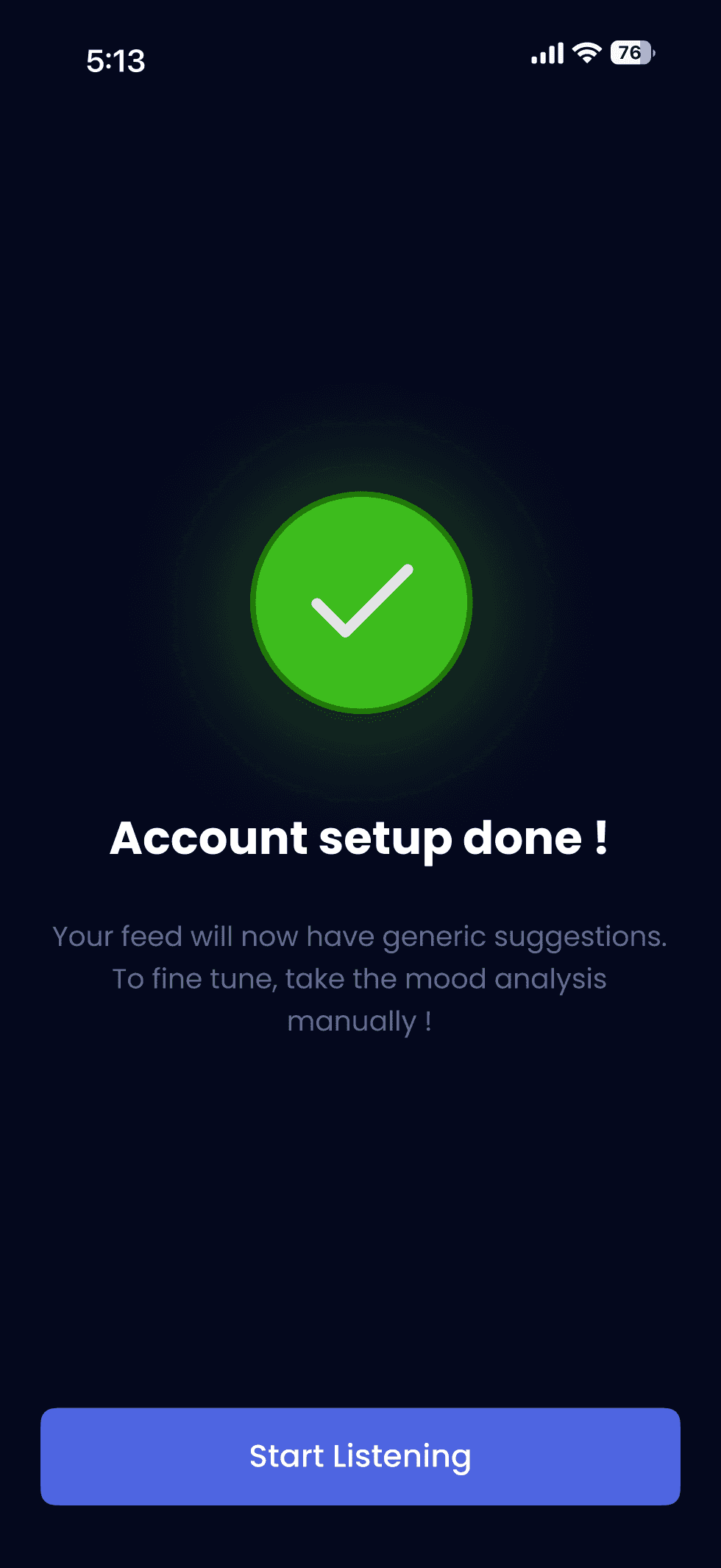
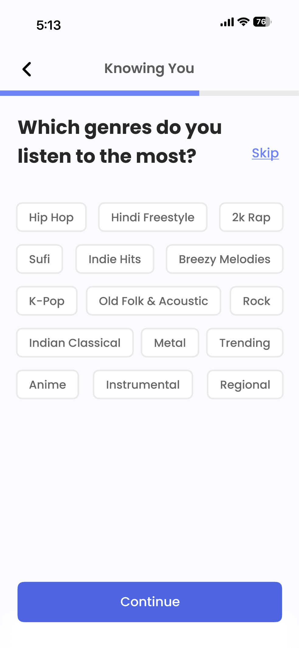
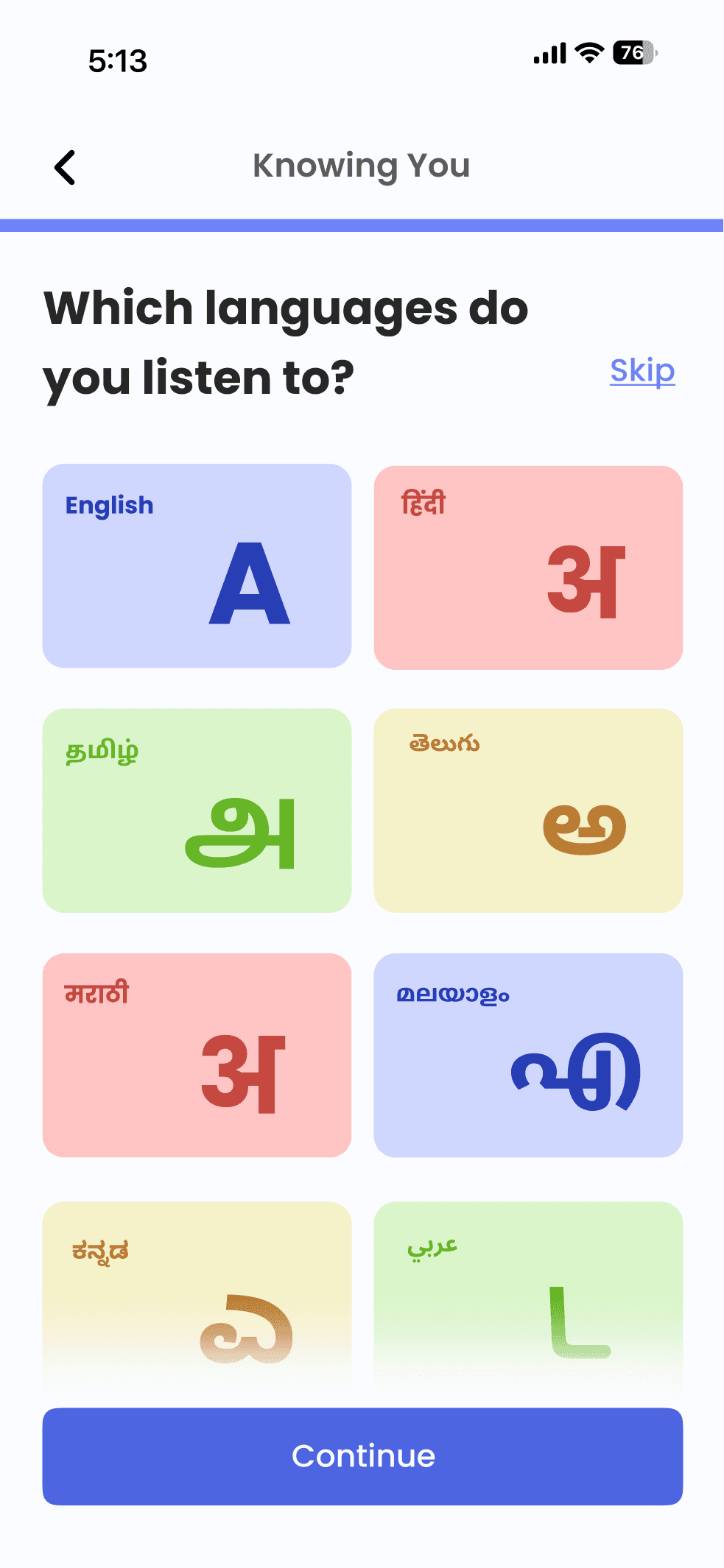
The onboarding experience's main purpose was to make it a step-by-step process, to ensure the first time user is able to grasp what the app requires from them to function as promised .
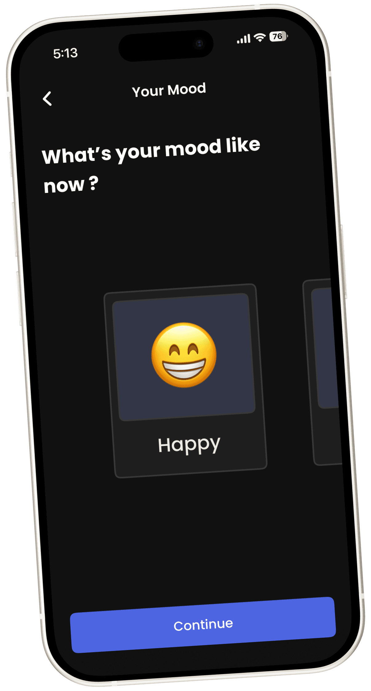
Alongside this, the mood analysis screens are also designed in such a way that it is easy for the user to quickly register their current mood !
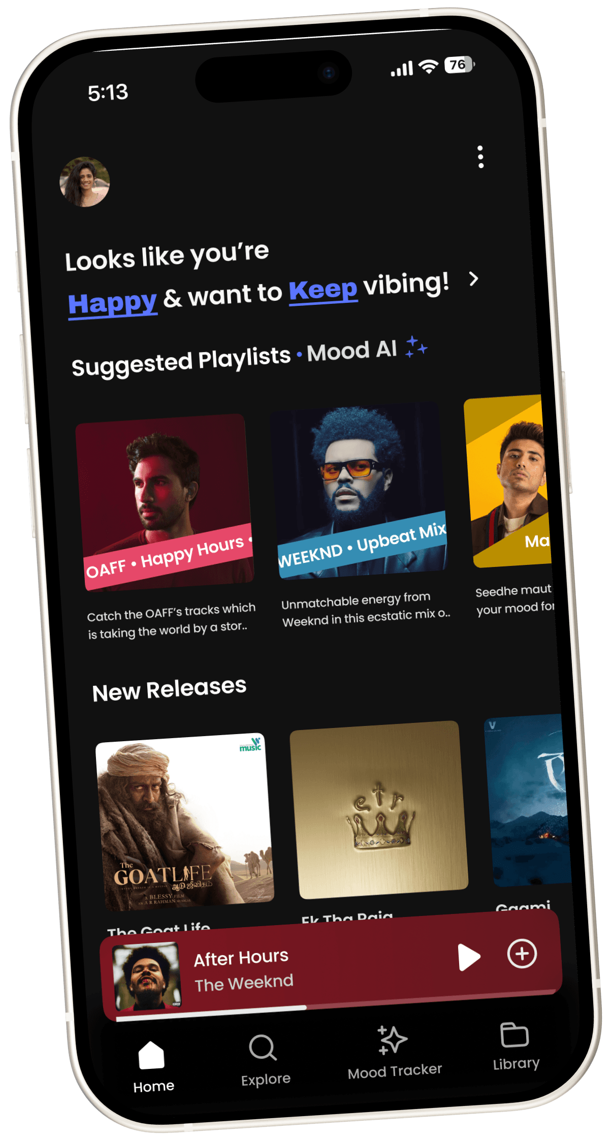
The Homepage for any application is essential in meeting both business and user requirements, so keeping that in mind, the homepage requires to be a holistic place
An assumption taken before we jump into the homepage screen is that our user preferably wants to use the “dark mode” of this application, so going forward all screens will maintain the same.
(The light version of the homepage is still shown below to get the knack of how the app would look so)
Jakob’s Law states that as users spend time on a plethora of similar apps, they expect an app in the same spectrum to almost look and work the same way.
For eg: Swiggy, Zomato etc all follow a similar visual design to induce familiarity
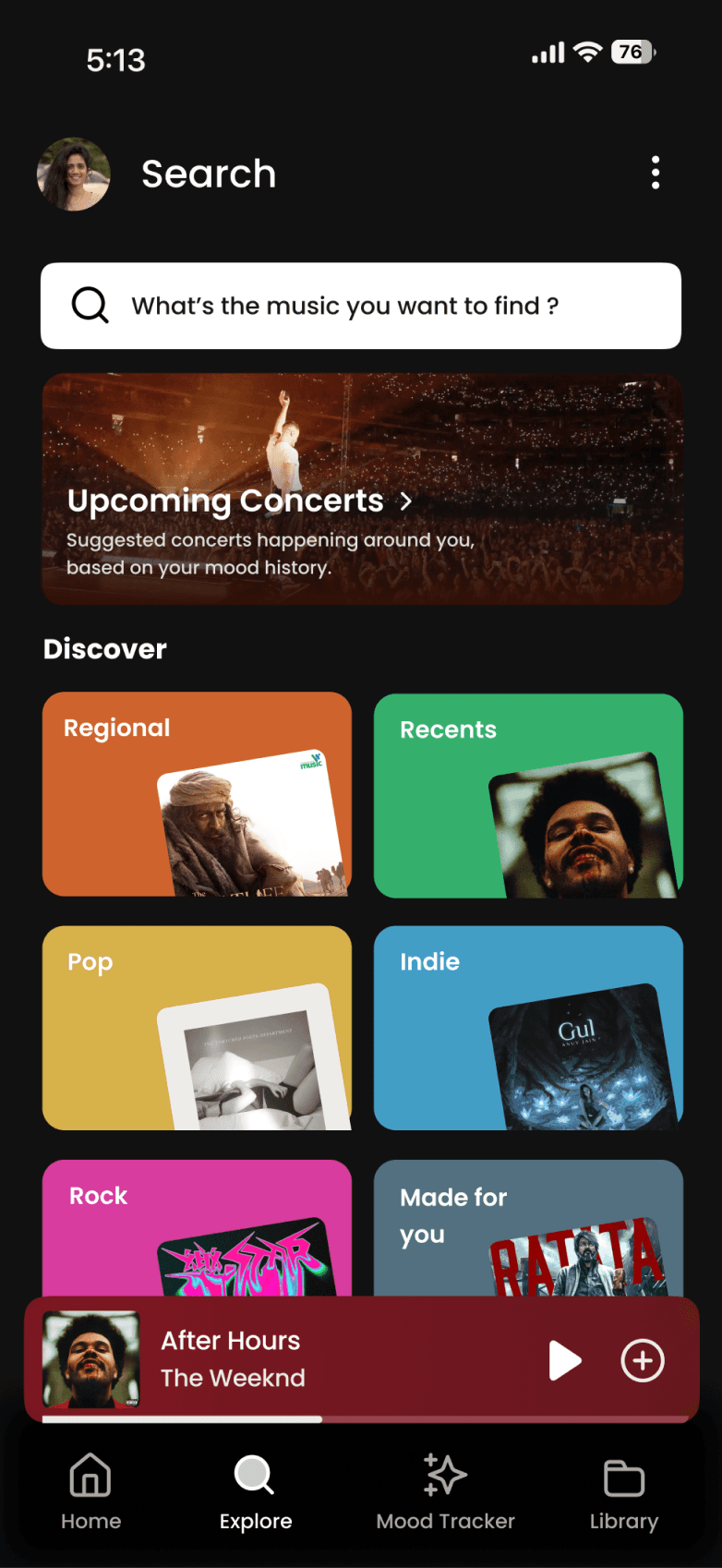
Why does the explore section look sooo familiar? 🤨
I’m taking advantage of JAKOB’S LAW here !
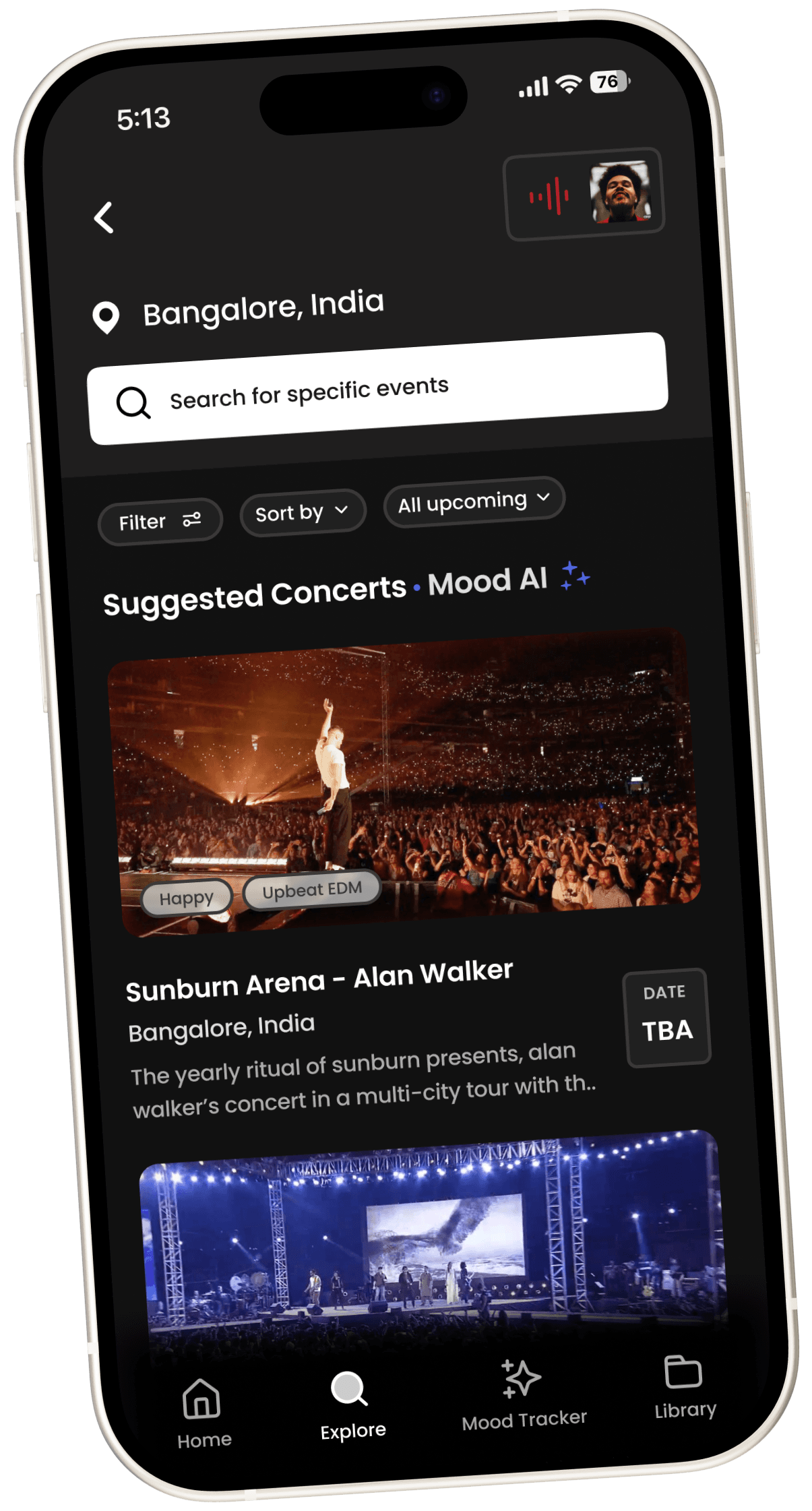
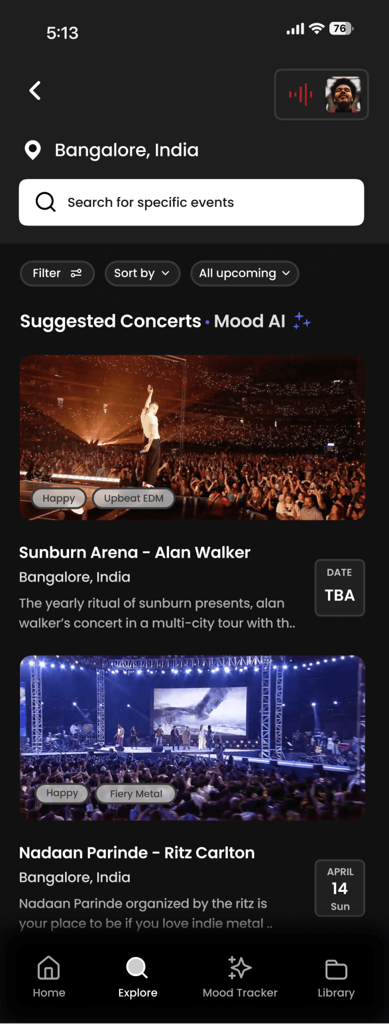
With a lots to pack and provide to the user, the concert explore homepage was carefully crafted to optimally give the user all information packed well.
Few decisions taken:
Information Hierarchy was maintained to ensure optimal experience in figuring information
Now playing music player minimized under concerts page to give a non-obtrusive view into this section (All other pages under the app will still have the normal mini player)
Filtering as an extra aspect allowed
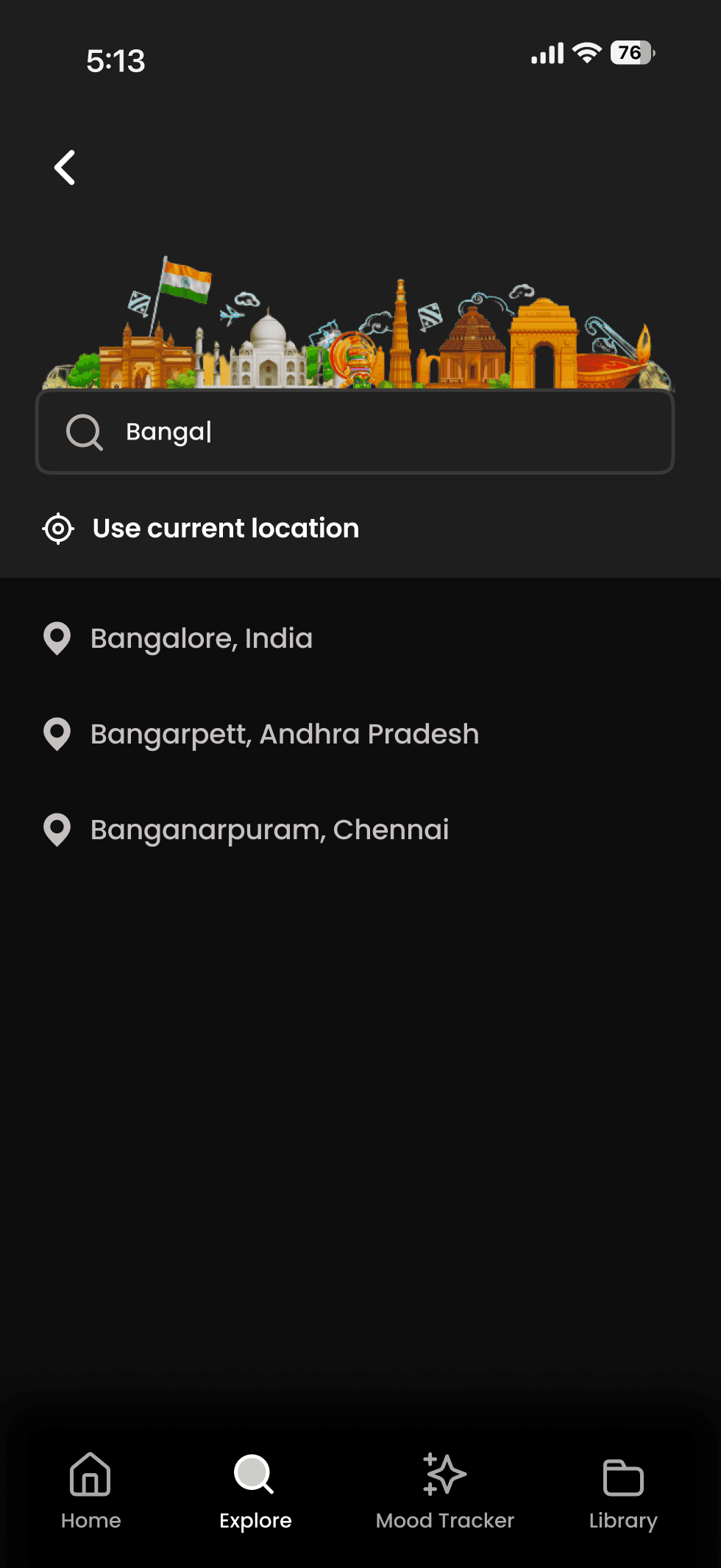
Users are given the choice of searching any other location other than current location too
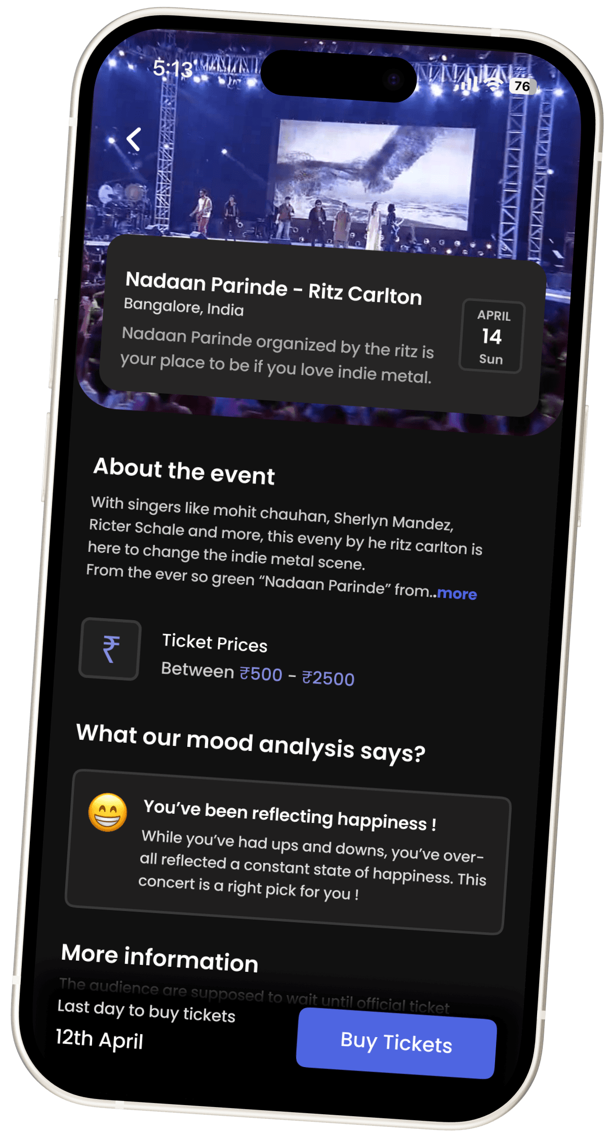
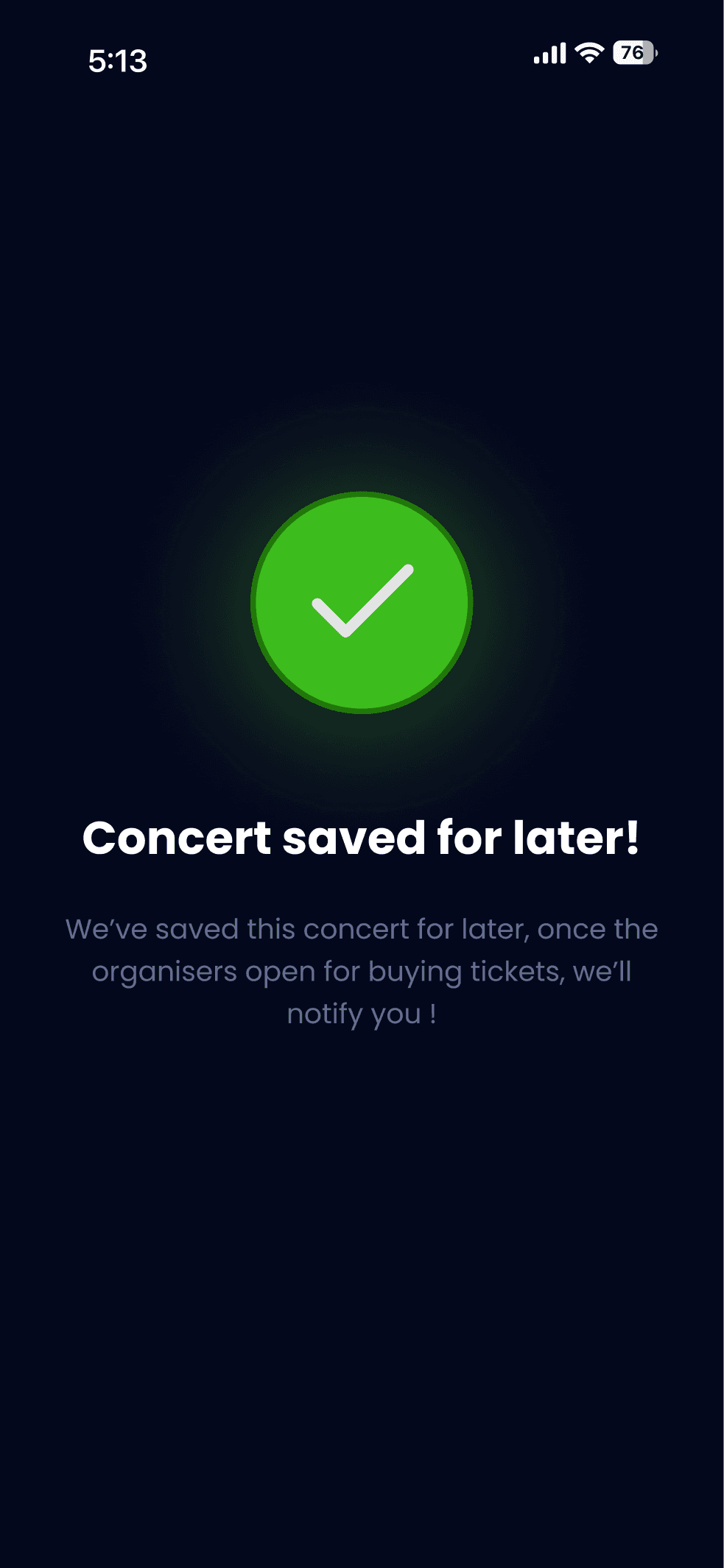
The concert information page while displaying all information as per need, allows the user to do two things, either save or buy tickets for the event.
While I didn’t dwelve into the flow of if the ticket buying would be in app or use the help of an external application because its too extensive for the time frame of the study, the save for later CTA would then give confirmation to the user and take them back to scrolling more!
Homepage
Explore - Music & Concerts
Concert Flow - The Explore Page
Search Flow (under explore page)
Concert Information Page
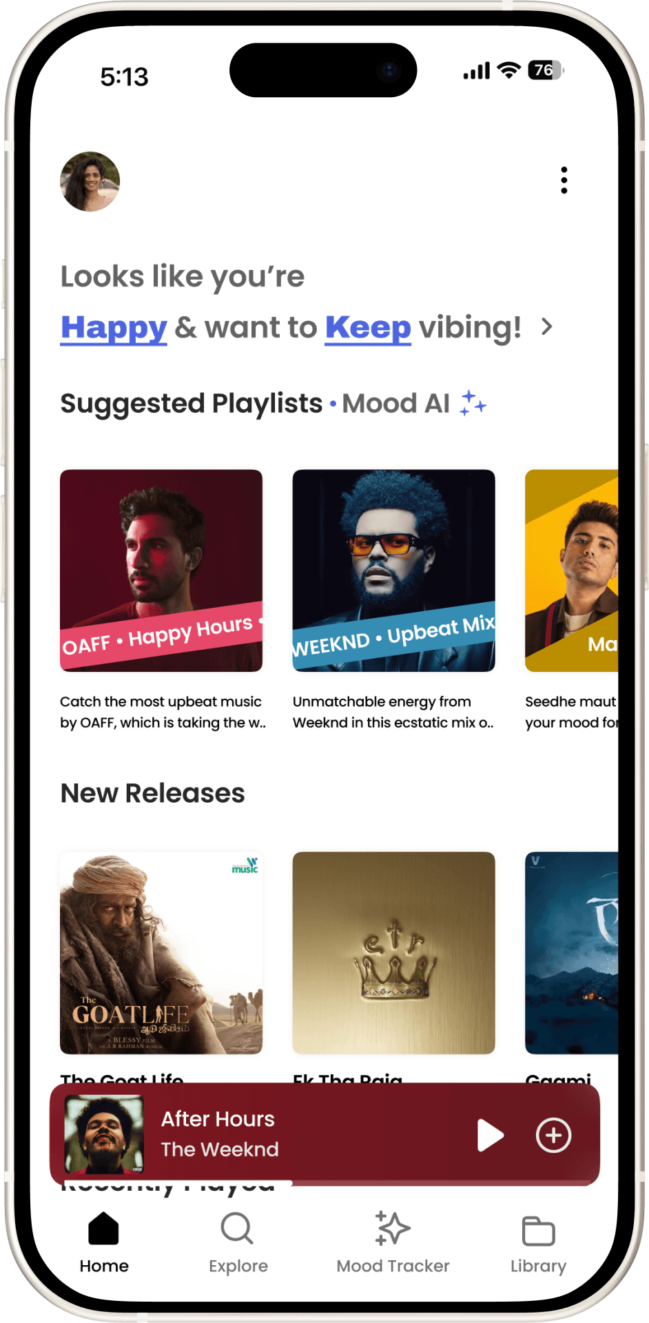
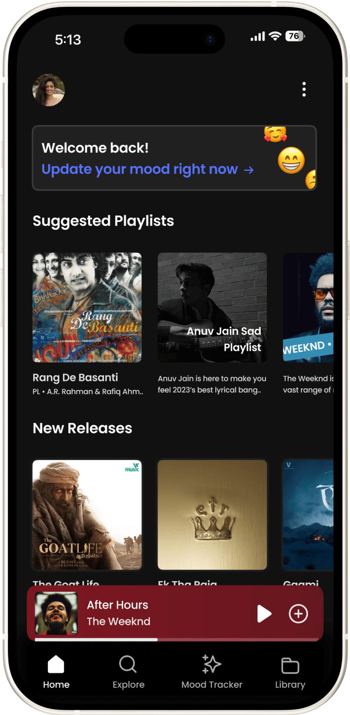
Light mode
Dark Mode
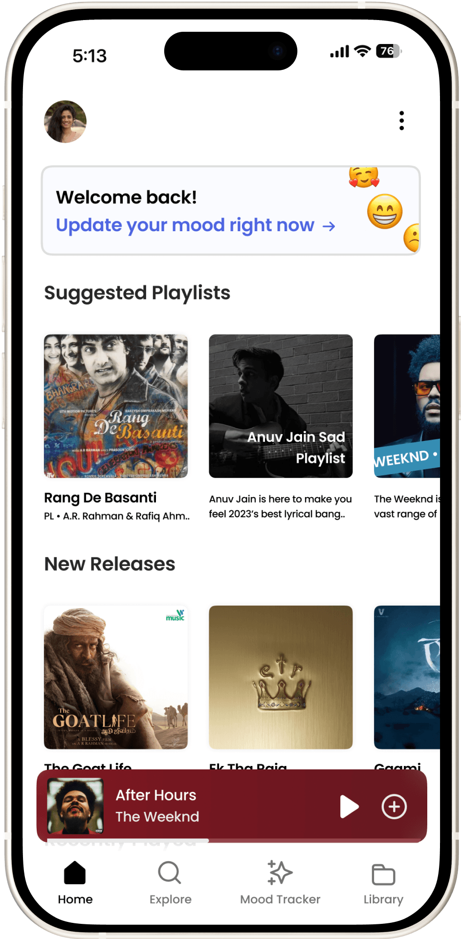
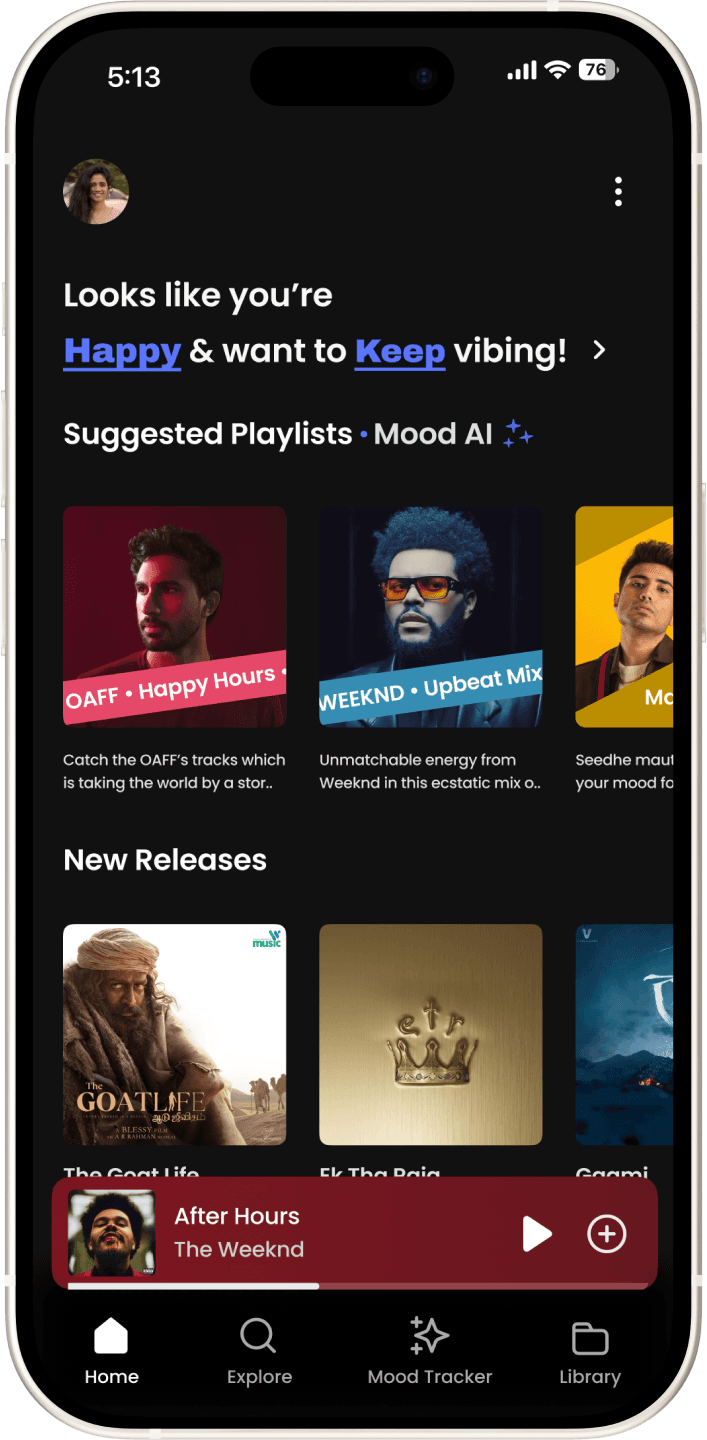
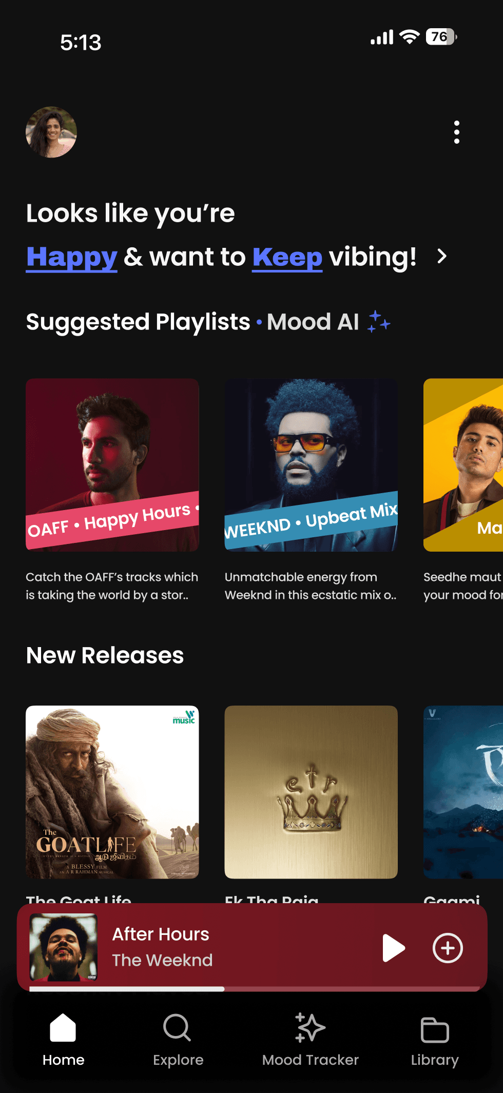
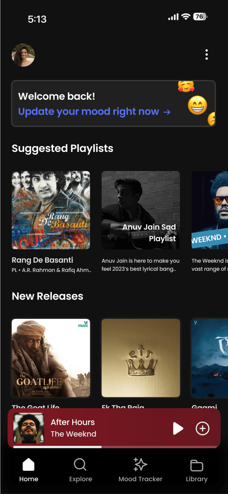
Current mood update indicator showing what the user chose to do with it
Default mini player for current song in session
Navigation Bar
User is notified with a text,
that the suggestions are now according to his/her mood.
Profile Section. Takes
the user to profile/
account settings page
When the user has opted
to take the mood analysis manually,
the following nudge is displayed
Users suggestions when not
opted for updating mood, will
display generic suggestions
Page Indicator
Concert Explore feature, with text to remind how this is also trained to suggest shows as per mood
Quick explore section with actionable CTAs to get into different genre of music, familiar to other apps
Searchbar to ensure users can find songs as per wish
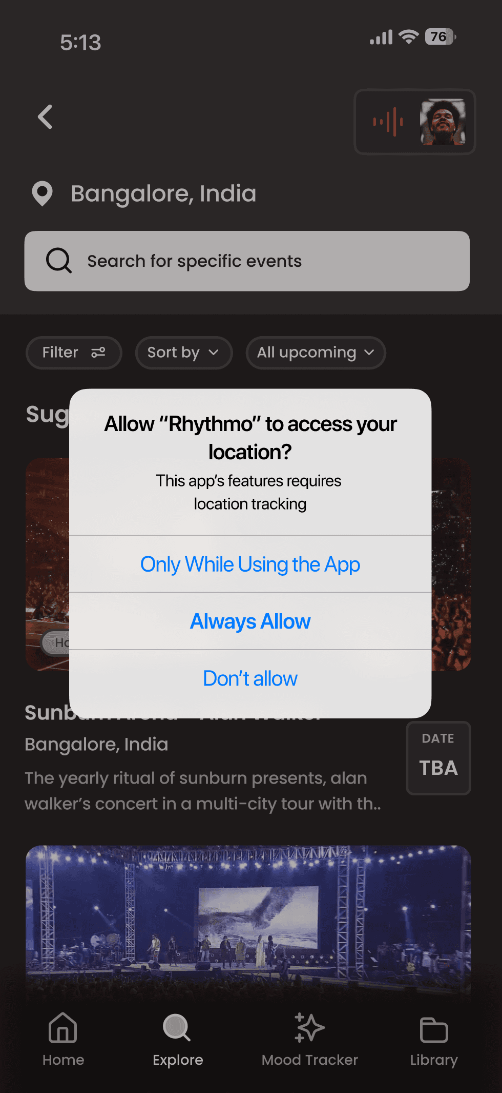
Location access requested
to maintain transparency and follow rule of privacy as per OS
Back button
Mini Player widget to still access currently playing music in app
Current Location
Search bar
Filter & Sort by
Scrollable Music Show Listing
Immediately accessible important information
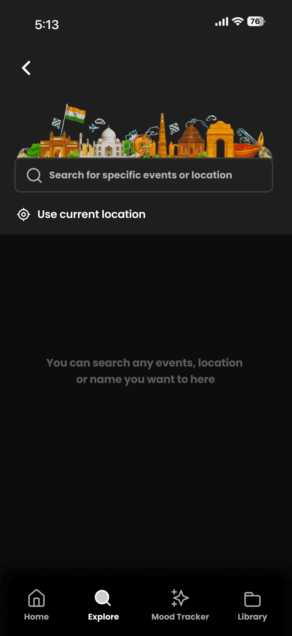
Blank State
Search State
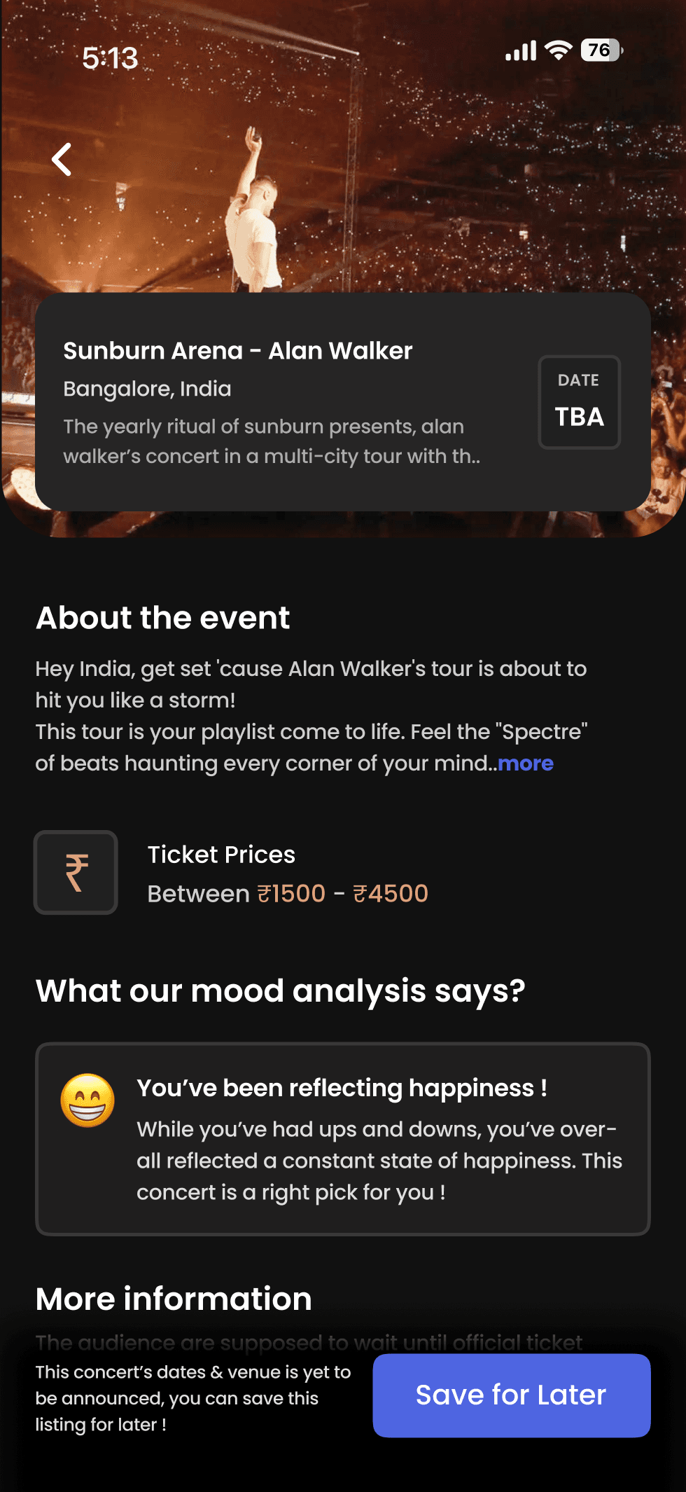
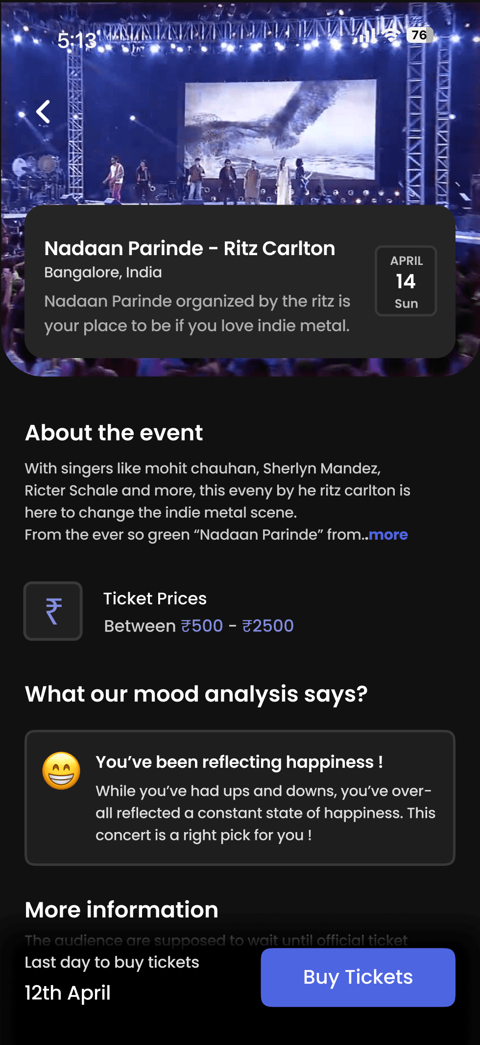
Quick at a glance information regarding the suggested event
Affirmation to how rhythmo’s mood AI came to conclusion to suggest this event at top
Information regarding dates and ticketing provided right near CTA button
CTA button to either save or buy tickets for event as per availability
Details regarding event from organizer
Mood Tracking Pages
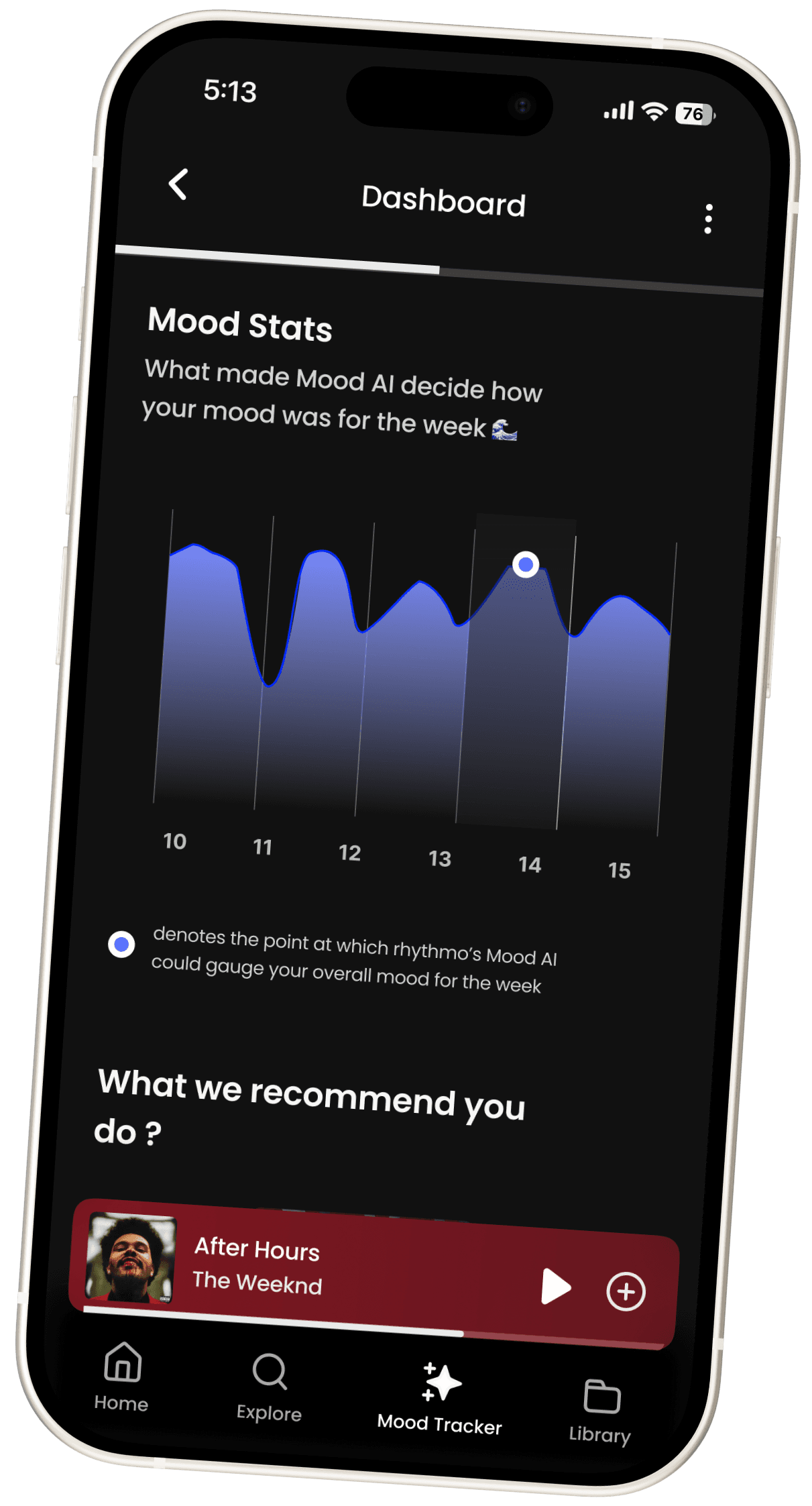
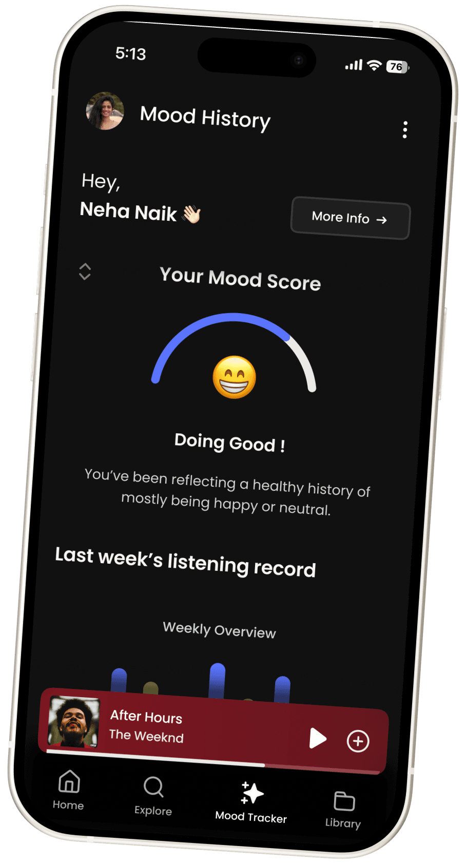
Being a crucial MVP feature of this application, the mood tracker pages/flow was carefully thought out and designed with respect to providing a fully intuitive experience to the user to both help them understand their own mood history and understand how it has influenced their music through gamification & graphs
Few things to note:
Users are greeted with an initial scrollable page with quick view into their mood history and metrics
A detailed dashboard with a two page view is also accessible to the user from here which has varied CTAs to help the user make use of the AI analysis’s as a part of a holistic experience
With the mood tracking feature being so densely packed what can we sum up it does as a whole ?
Glance Dashboard : The initial dashboard offers high priority gamified visuals to engage user and to get to know their mood better. “Mood score”, “past week’s mood history”, “top artists as per mood” are all such features in the page
Detailed Dashboard Pages : The two detailed dashboard pages aims to let the user take more control over the learning about their mood and the interweaved features the learning trickles down to.
This involves letting the user know what was the deciding factor, CTAs to multiple other interlinked features and fresh suggestions apart from top artists and playlists to make the learning even more worthwhile and let the user know these recommendations are tailor made for them !
A total sum of 20 out of total respondents were given a prototype of this application to test in regular intervals since ideation stage to the final design stage where a fully functional prototype from onboarding to all app screens were ready.
Unanimously these were the feedback iterated & worked on and to be worked on :
Changed:
The initial onboarding welcome screen had an real to life iPhone mockup to display the preview, later changed to 2D white mockup instead.
All CTAs mentioned were reported to be small by 60% of the users, iterated and now corrected.
Now playing mini player minimised to widget under concert pages to ensure more viewport as per feedback.
To be worked on:
70% of users wish to see a flow for buying tickets.
A bunch of users wish to see more customisation in terms of blocking artists, adding situational mood analysis (for eg: hitting the gym but the user is frustrated etc. )
Users wish to see the onboarding welcome page also highlight the other features of the app as a carousel effect.
Testing Phase

Scrollable Main Page
CTA button to enter detailed dashboard view
Past week’s listening record as per mood in the form of a gamified bar graph
Scrollable top artists section which is curated by AI as per the past week’s mood history
Nudge stressing to enter detailed dashboard to explore more features !
Metrics to what the colours in the chat mean and what is still being analysed
Gamified “Mood Score” to immediately let the user know how their mood’s been even if the user doesn’t find time to scroll and understand more

Scrollable Dashboard Page 1
Scrollable Dashboard Page 2

Page Indicator
Graph signifying the point which let AI decide the week’s overall mood
Artist recommendation as per week’s mood, highlighted in brand color
Top AI Playlists as per week’s mood history
CTA to take mood analysis again, if user decides to do so
Positive yet open message to user on reporting errors if any
Metric information to signify use
CTA button to refresh recommendations to new suggestions
CTA button to nudge users towards concert explore feature
Re-affirming message. This message varies as per mood report
Other Pages
General Positive Feedback
Takeaways (for me, as a designer)
Understanding the core aspects of an engaging UX was a welcome learning for me.
Uncovering the fact that every problem statement eventually does have a set of users who’re keen to see if there’s a solution.
I could sense an increase in expertise when it came to my user interface designing skills and that was a great by product of this case study
With this case study, I understood the importance of the “whys” and “why should theys” behind every decision taken.
As this was quite a quirky idea of in terms of how a music application can expand its horizons and explore what it can do, researching, ideation and making choices for this task was a great learning.
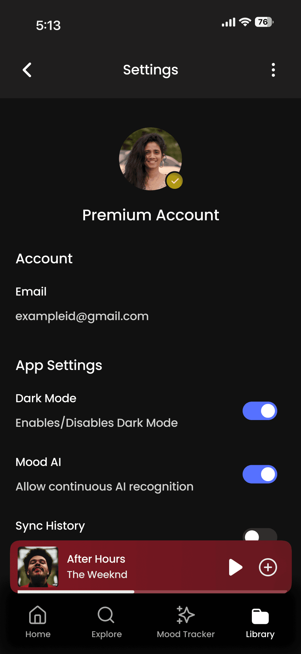
Profile/Settings Page
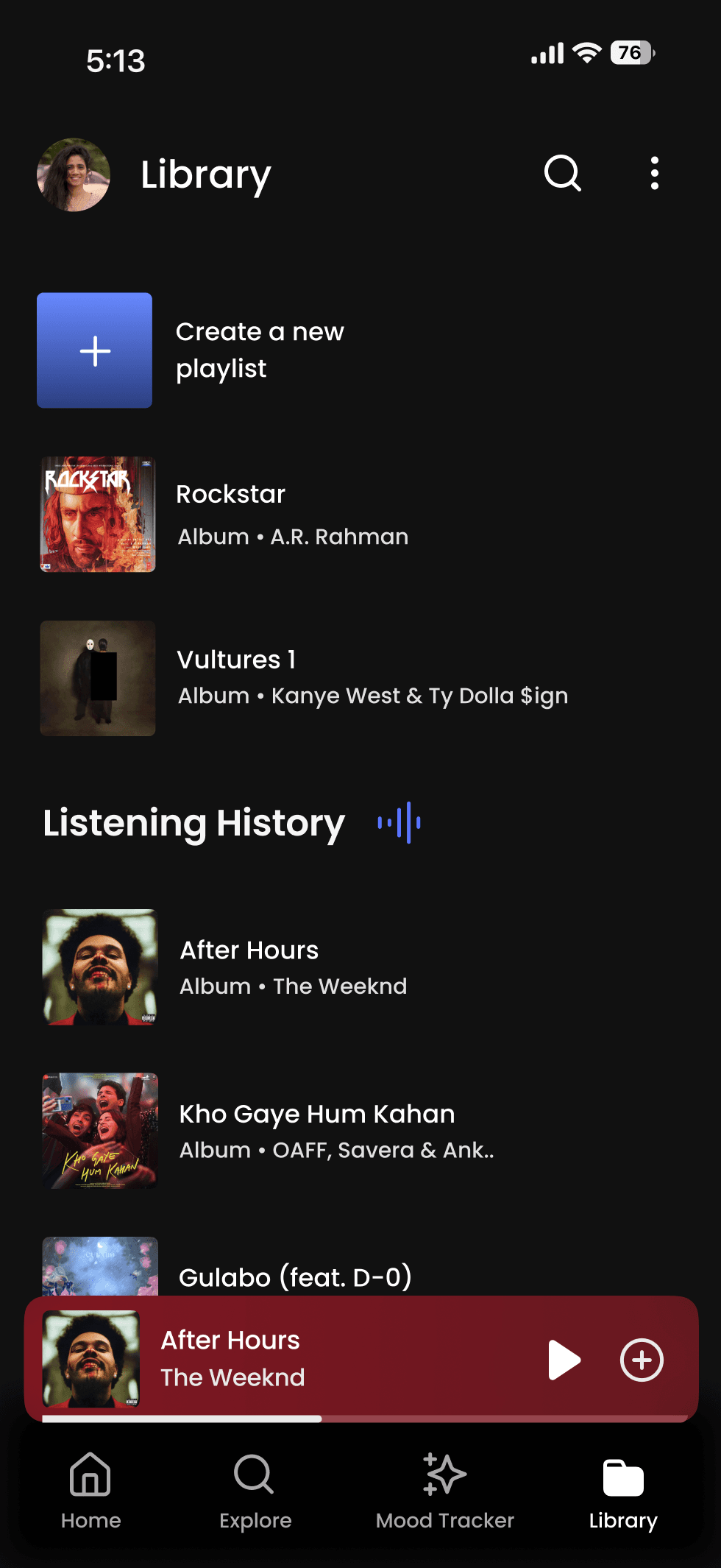
Library Page with History
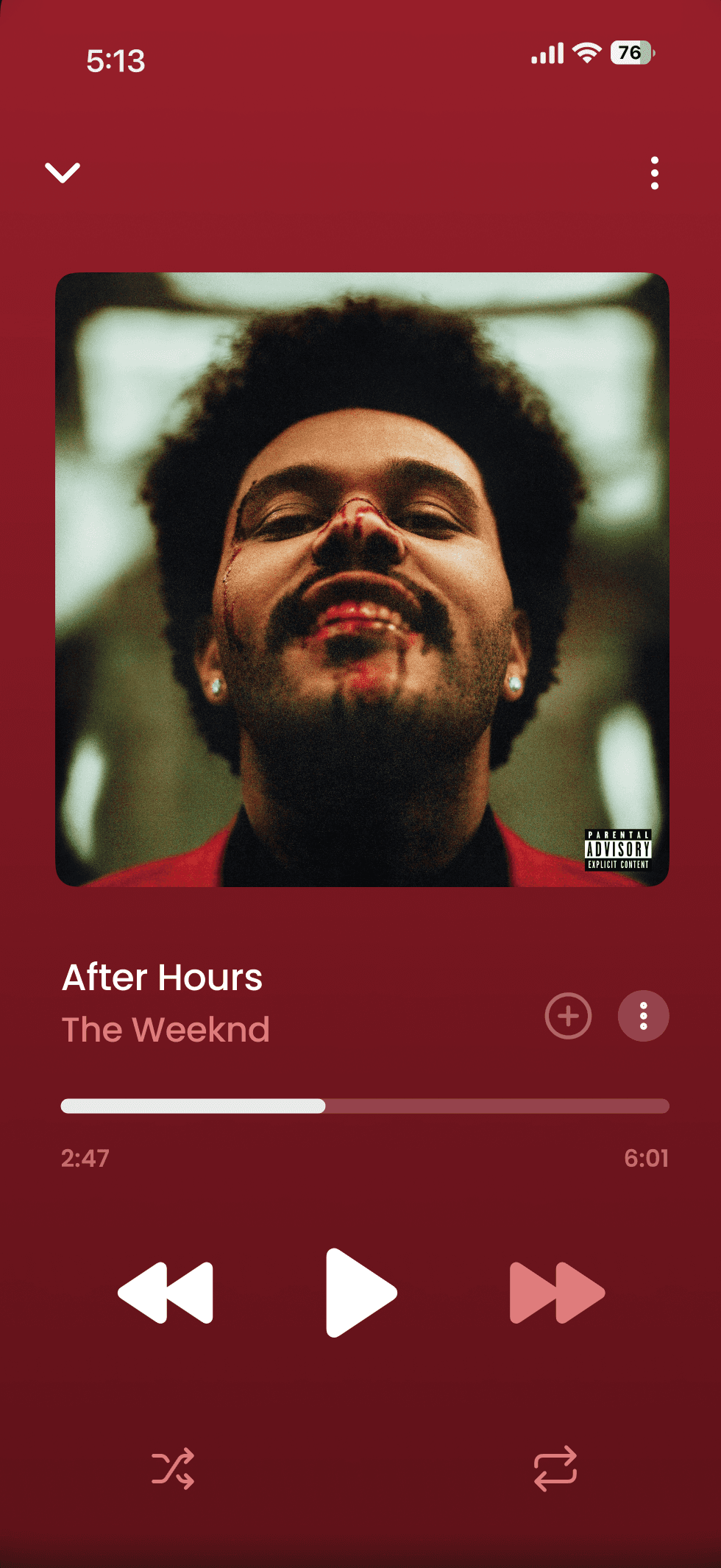
Music Player
80% users appreciate the familar nature of the app while inducing a user focused features helping achieve more in terms of what a music application can be/do.
Iterative testing allowed me to ensure constant change as per feedback, which was highly appreciated by users who were part of seeing the changes unfold as per feedback.
More than half of the population of users gave feedback that the user experience is easily graspable right from onboarding until understanding other MVP features of the app
Get.. Set.. Design!
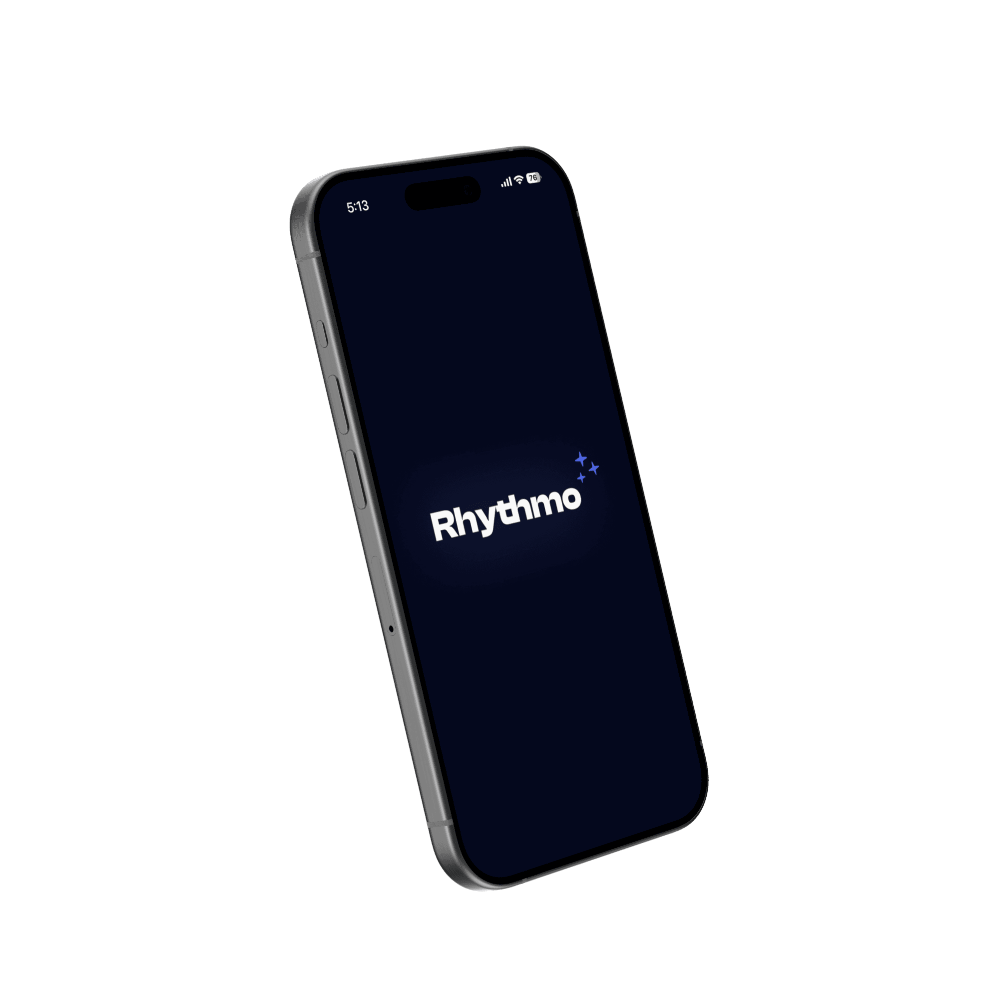
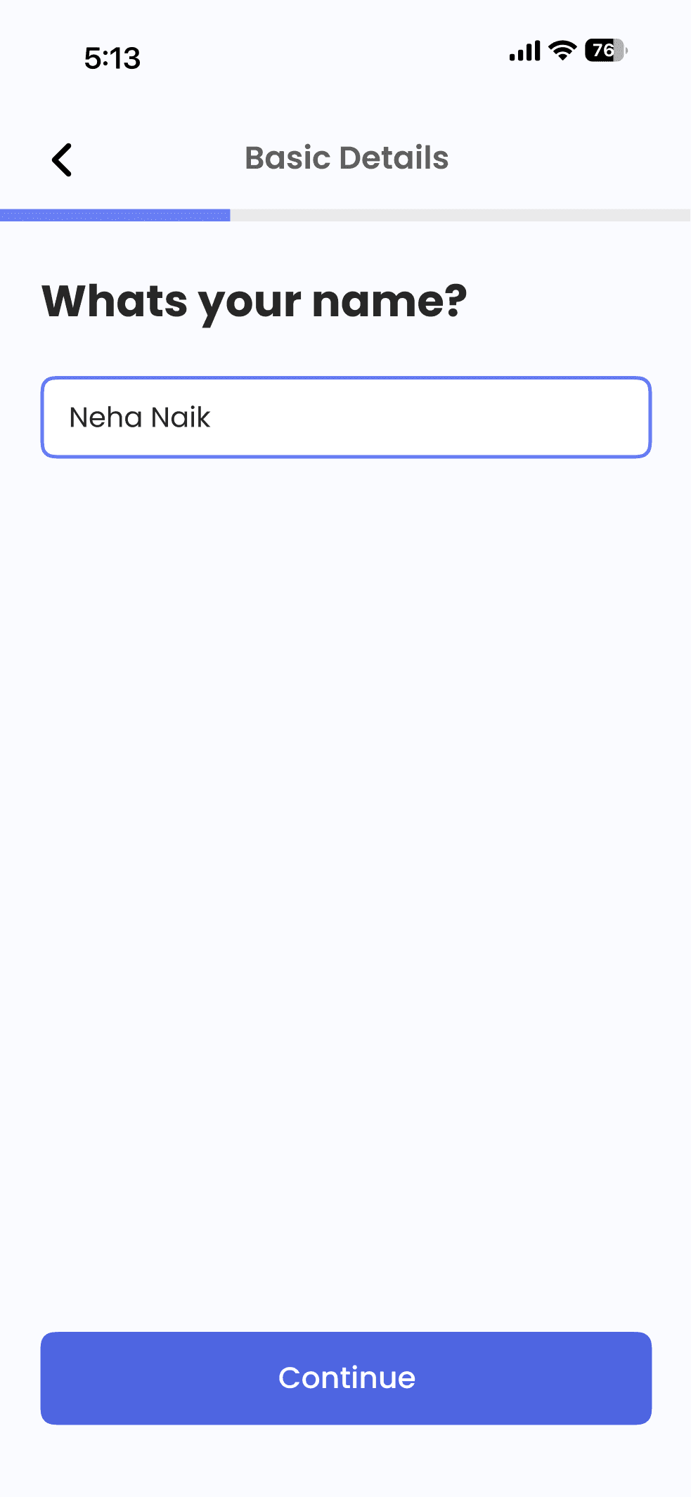
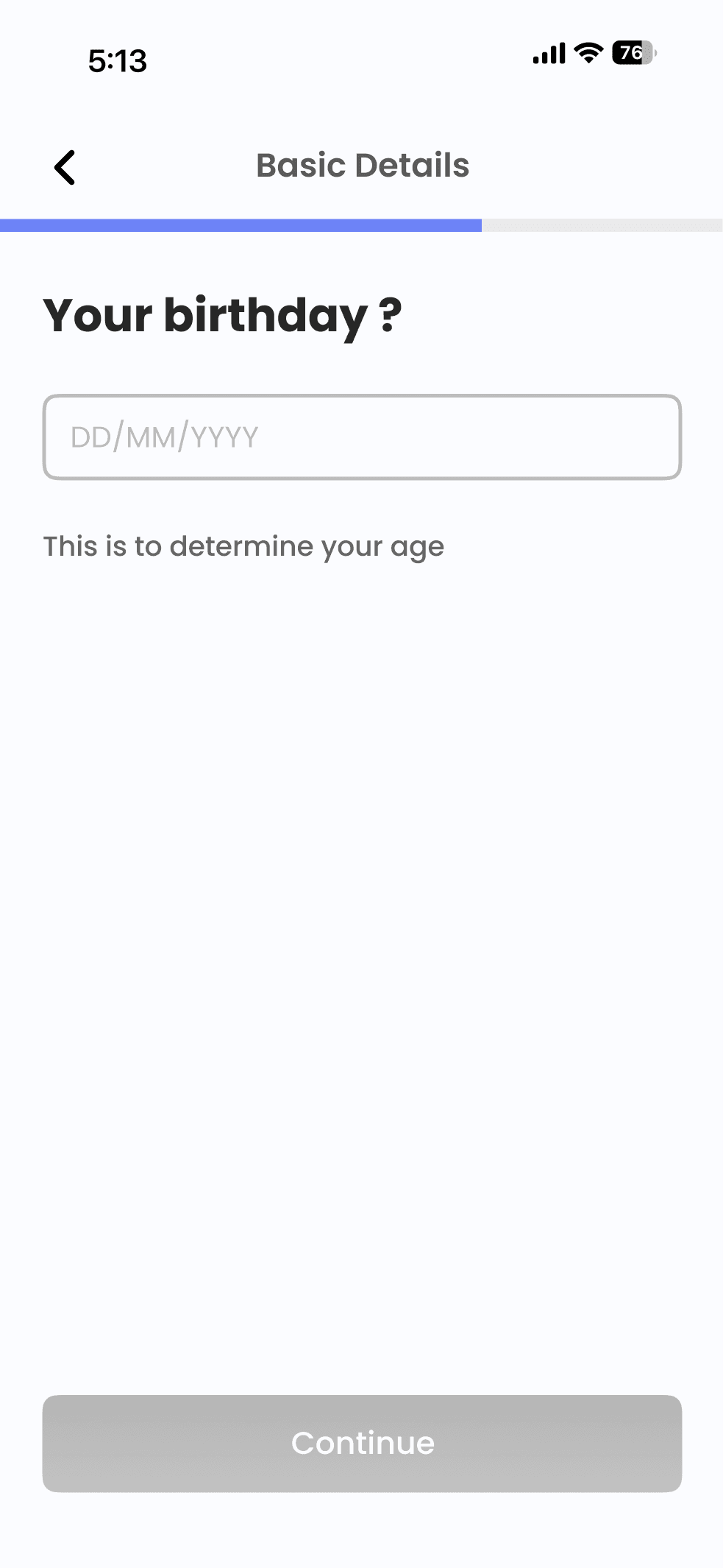
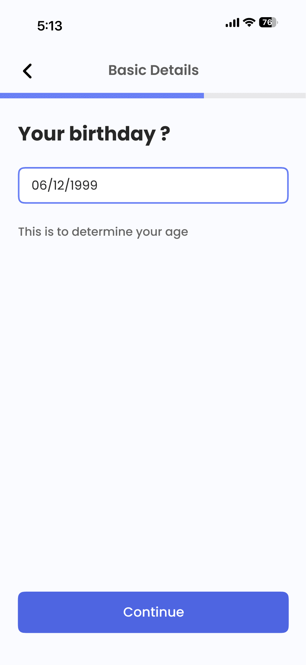
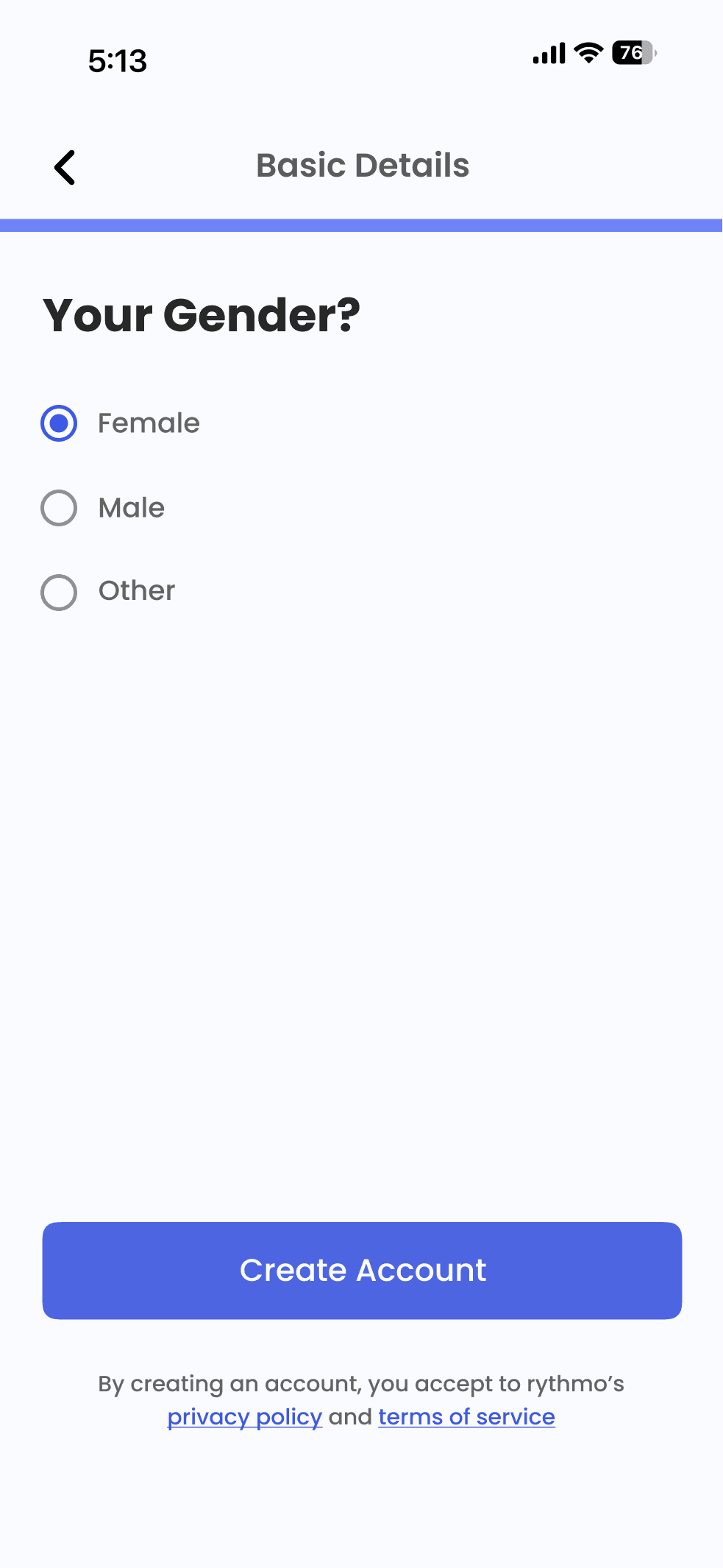
Onboarding - Sign Up, Account Setup & Initial Mood Analysis Flow
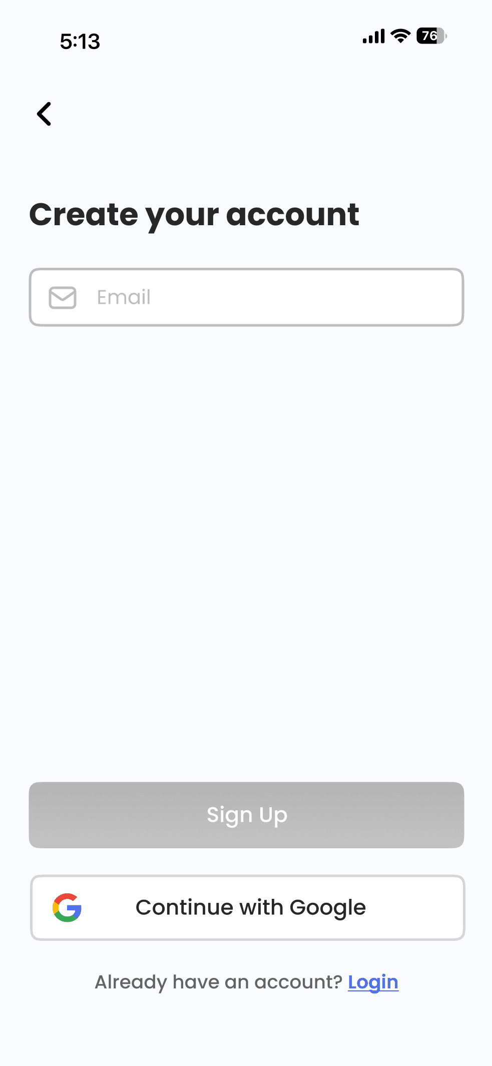
With the onboarding flow which involves the above stated screens in continuity, the aim was to keep it really easy to navigate and understandable.
A few decisions made to reflect the same:
• The users are greeted with a light theme, making it a welcoming experience
• Progress Indicators during account setup to motivate finishing the task
• A crisp flow for “Music Taste Analysis” screens.
• A clear yet precise mood analysis screens with necessary information to be conveyed which will be shown every time a user opens the app (if they opt for the same) .
Apart from this, an assumption taken is that, our user is going to opt for the email signup amongst available options

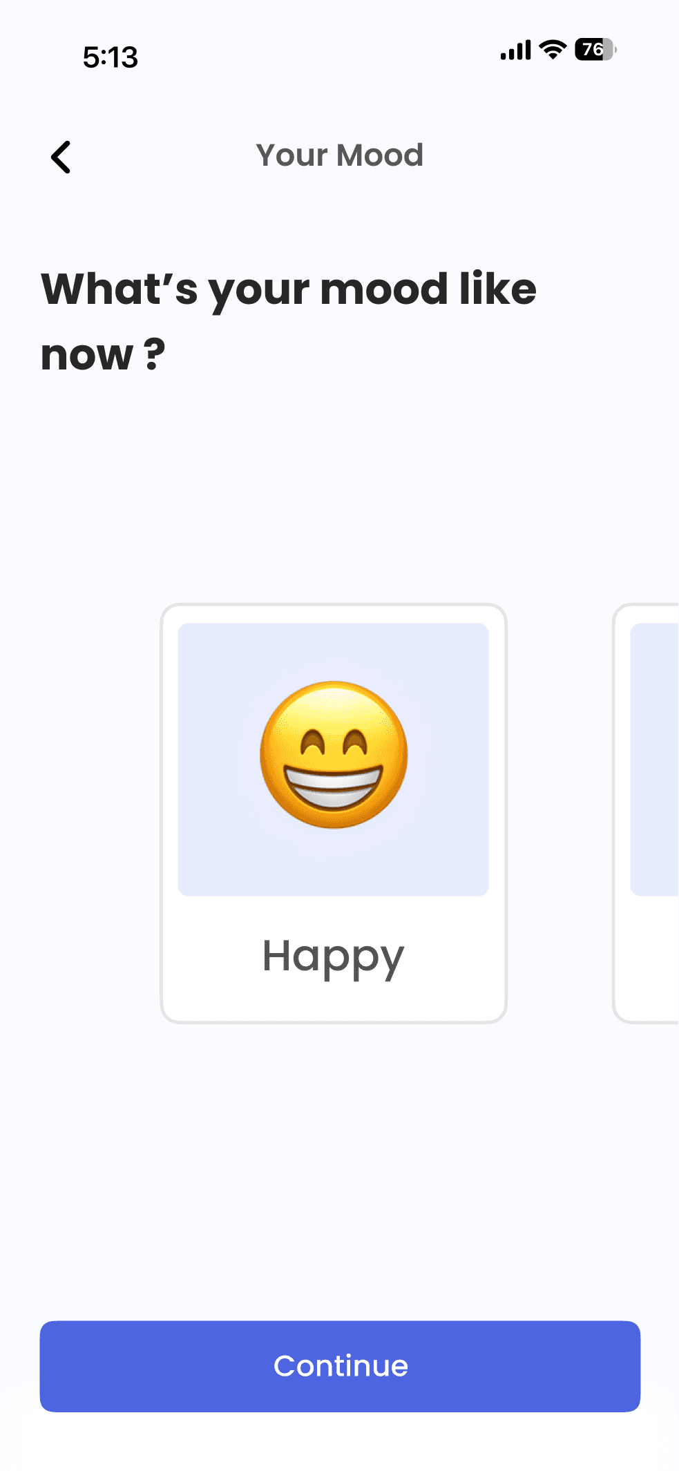
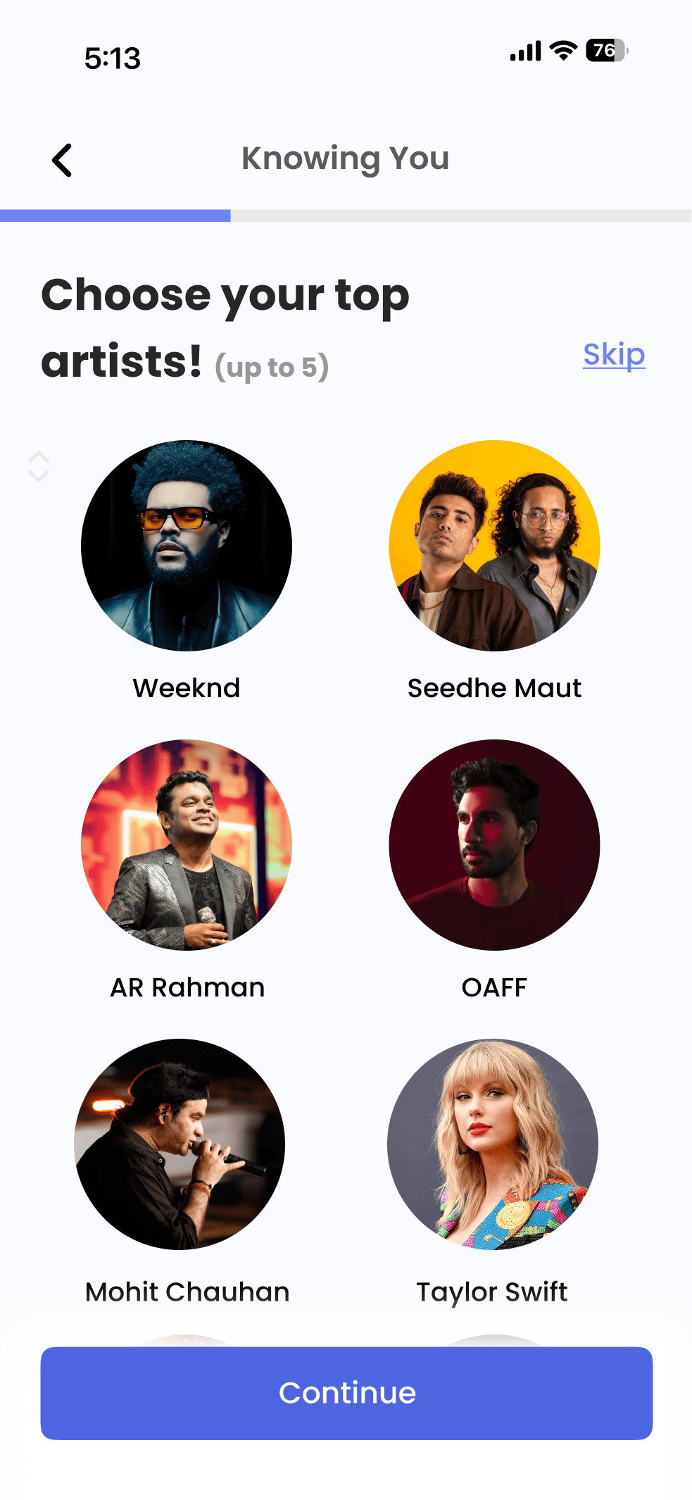

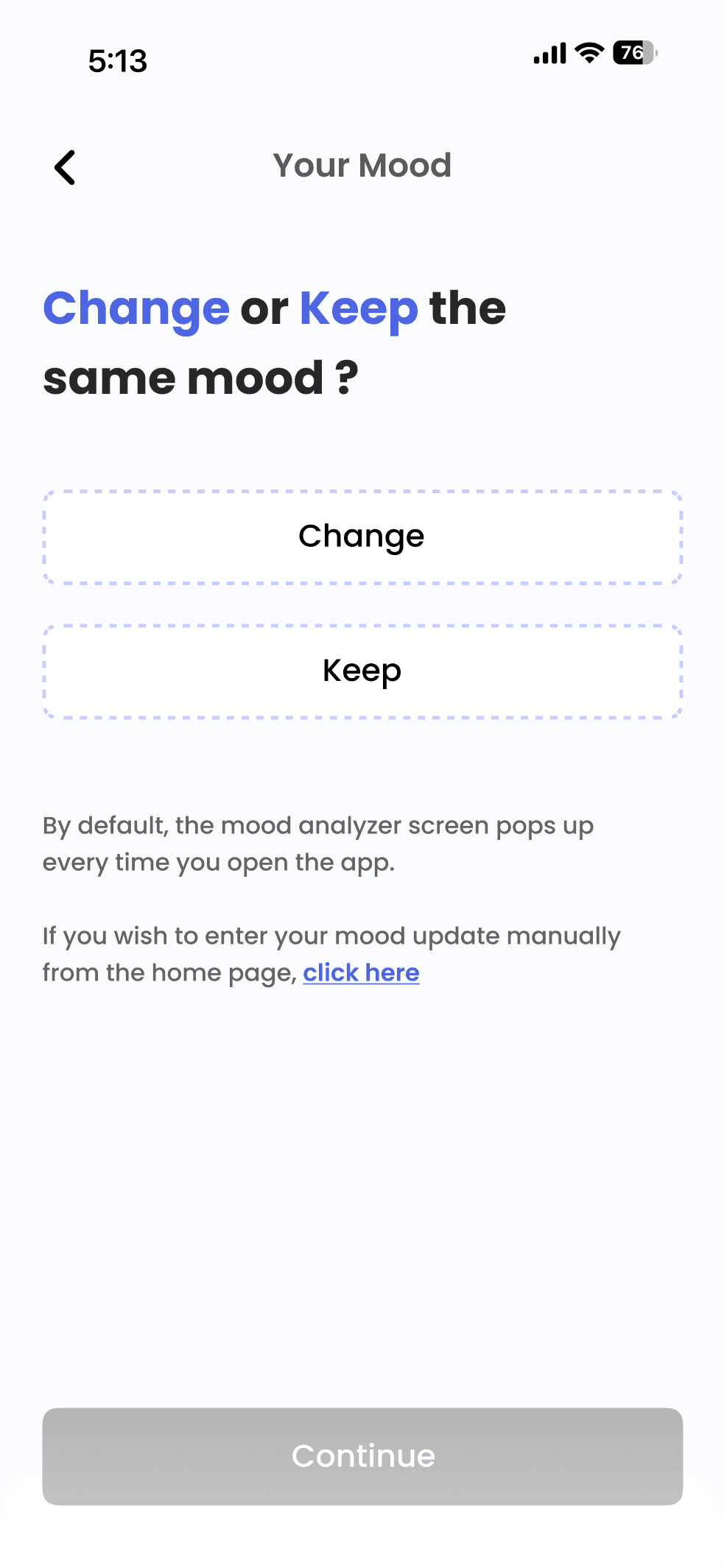
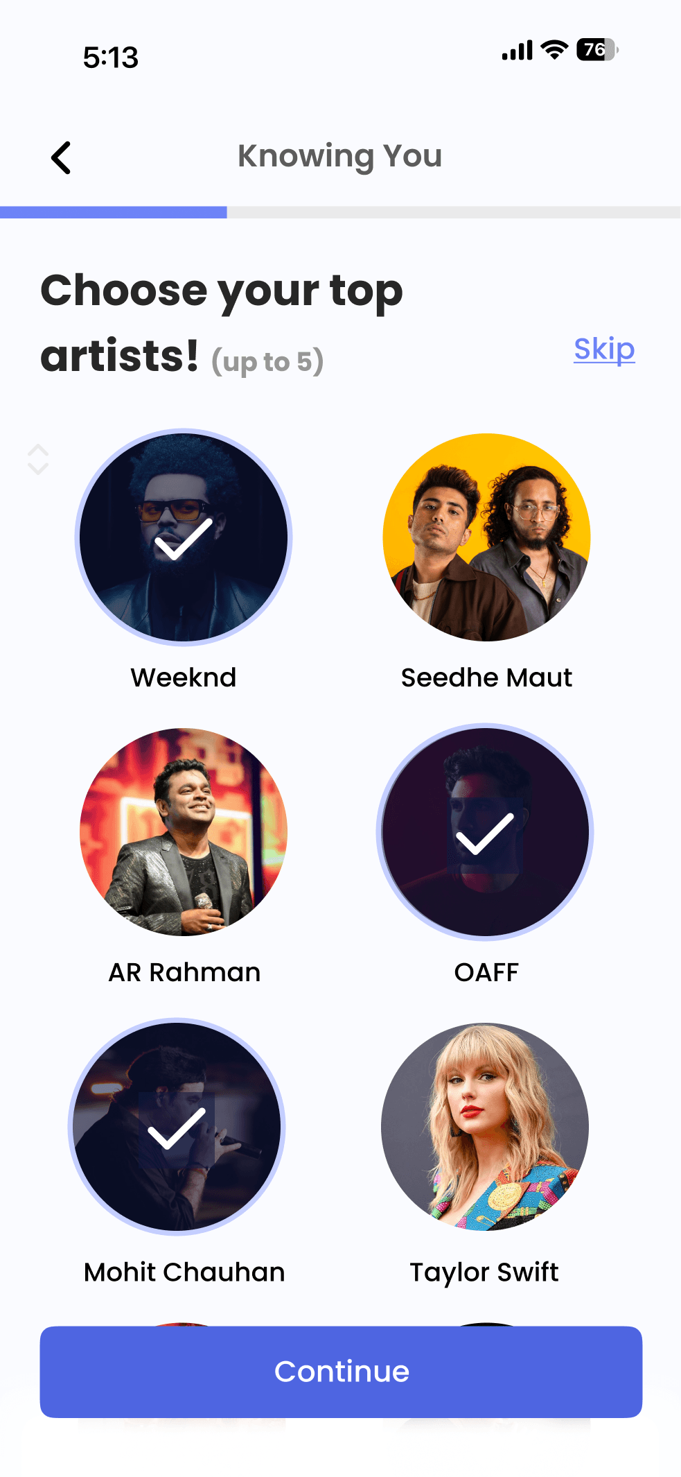
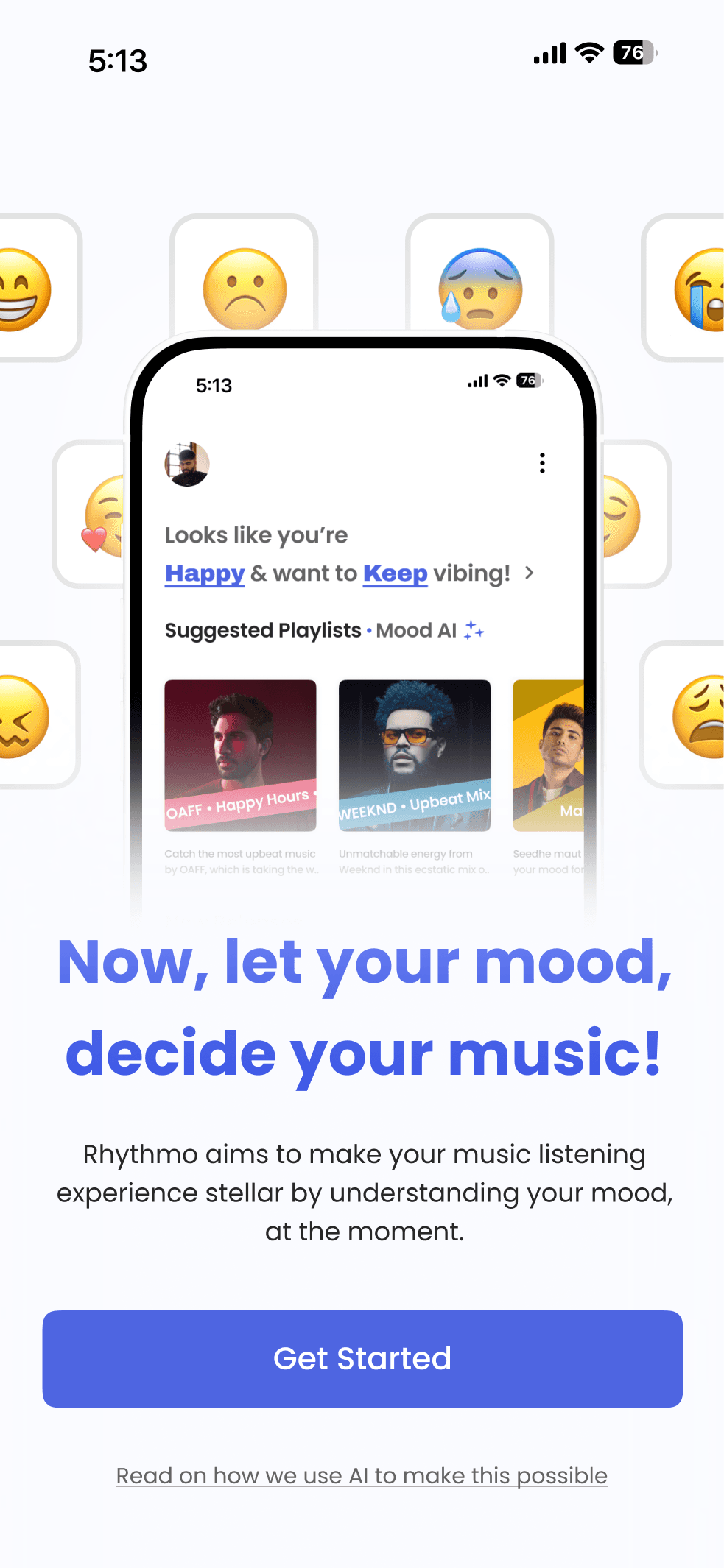
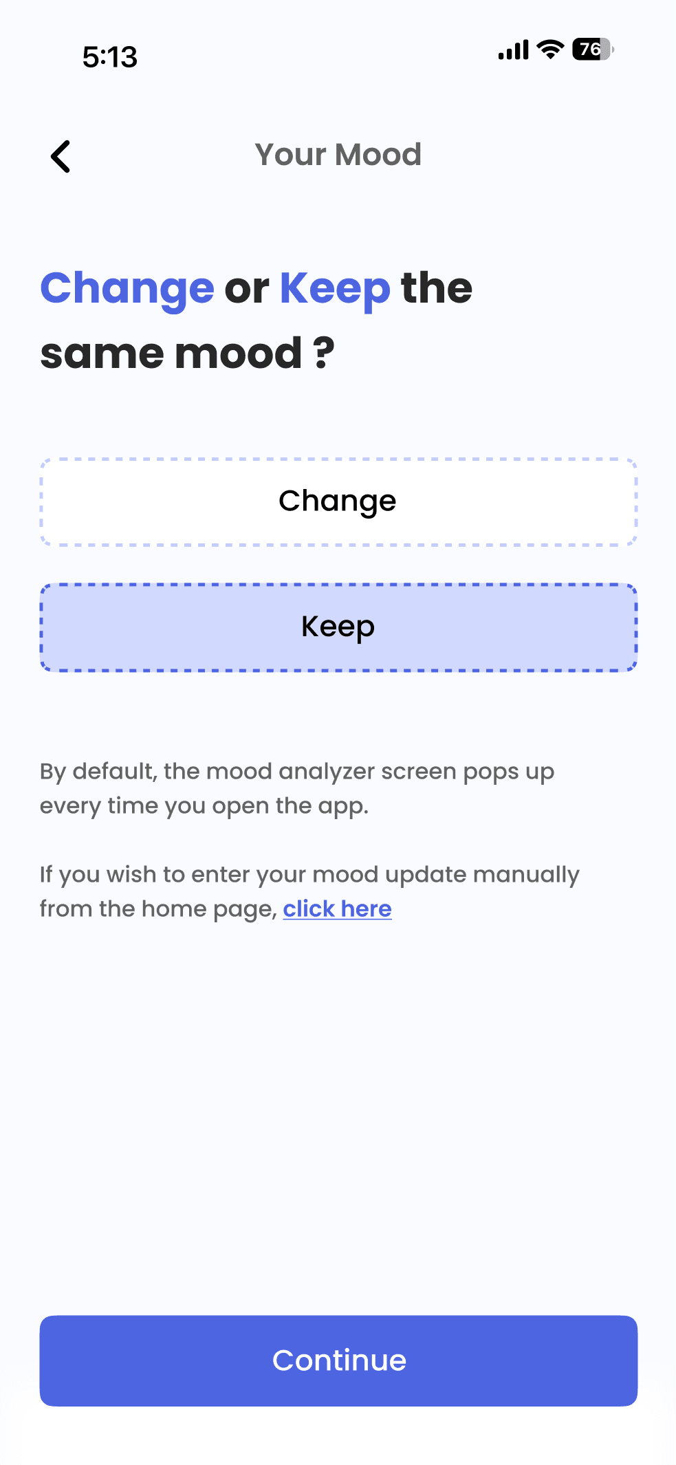
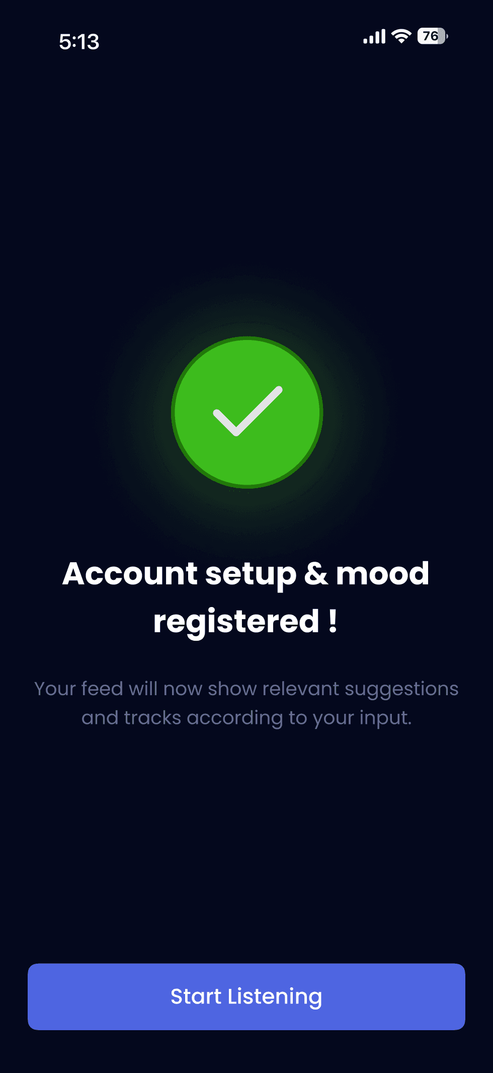
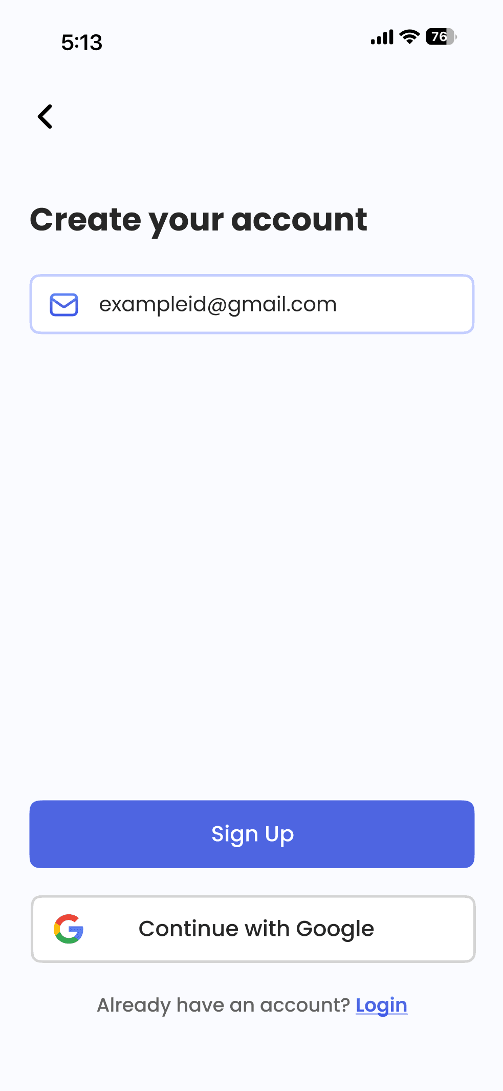

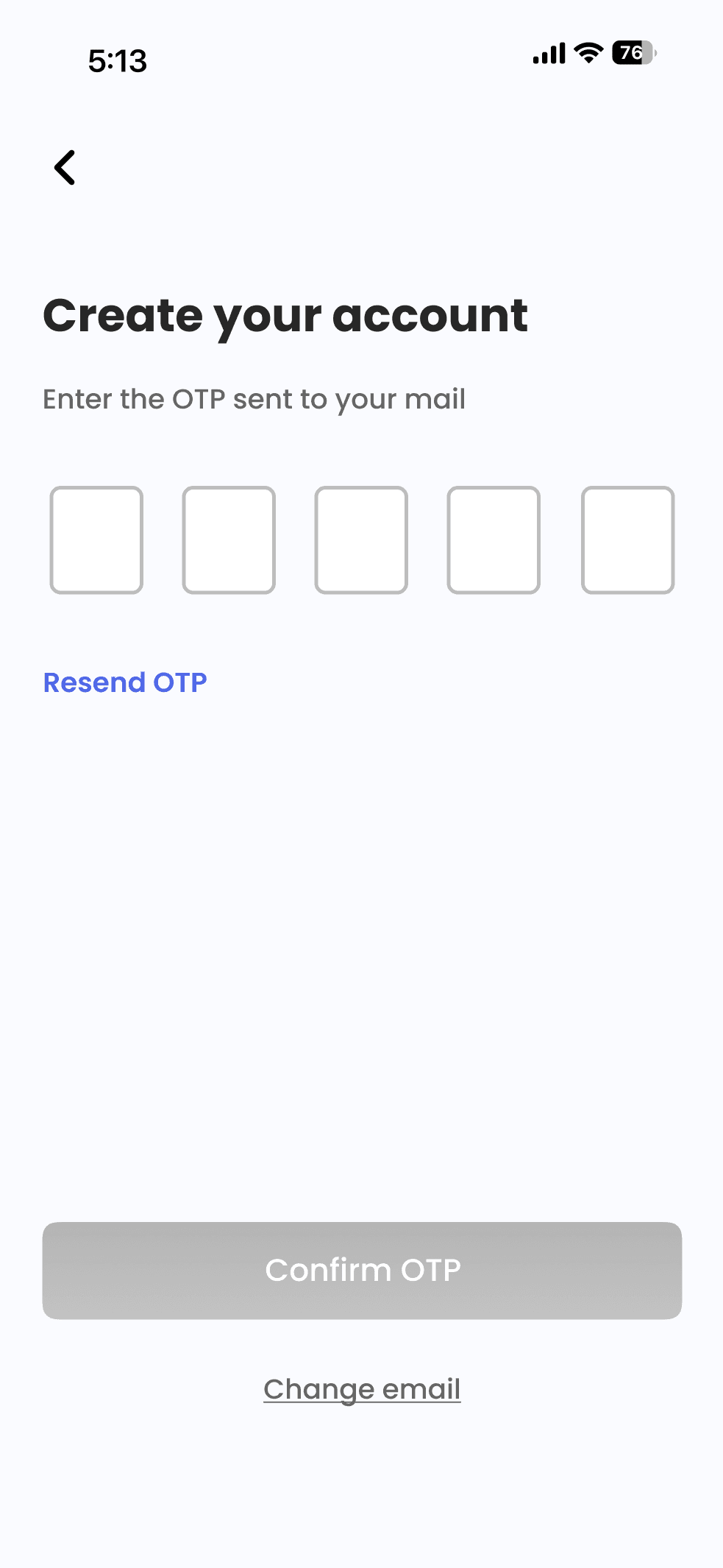
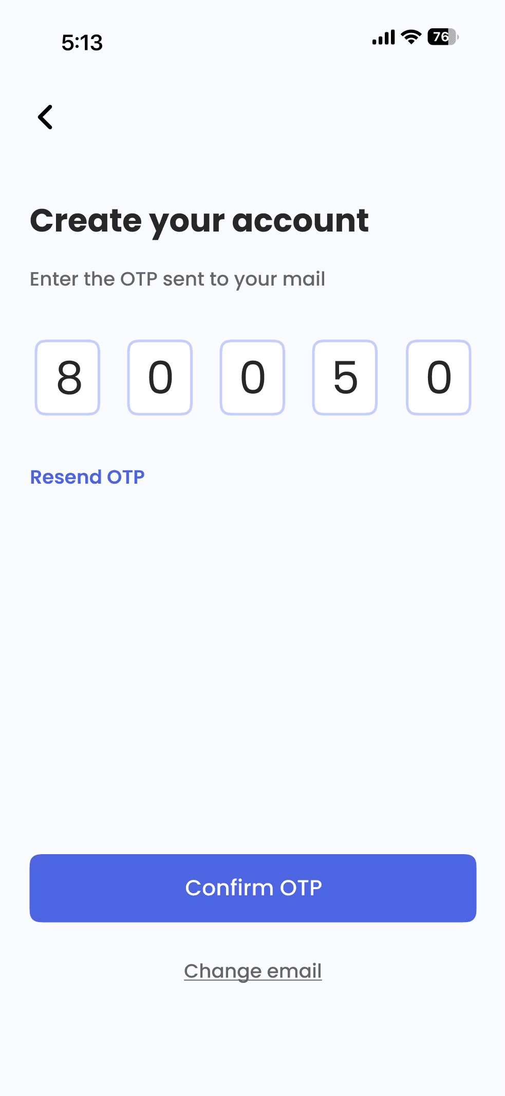
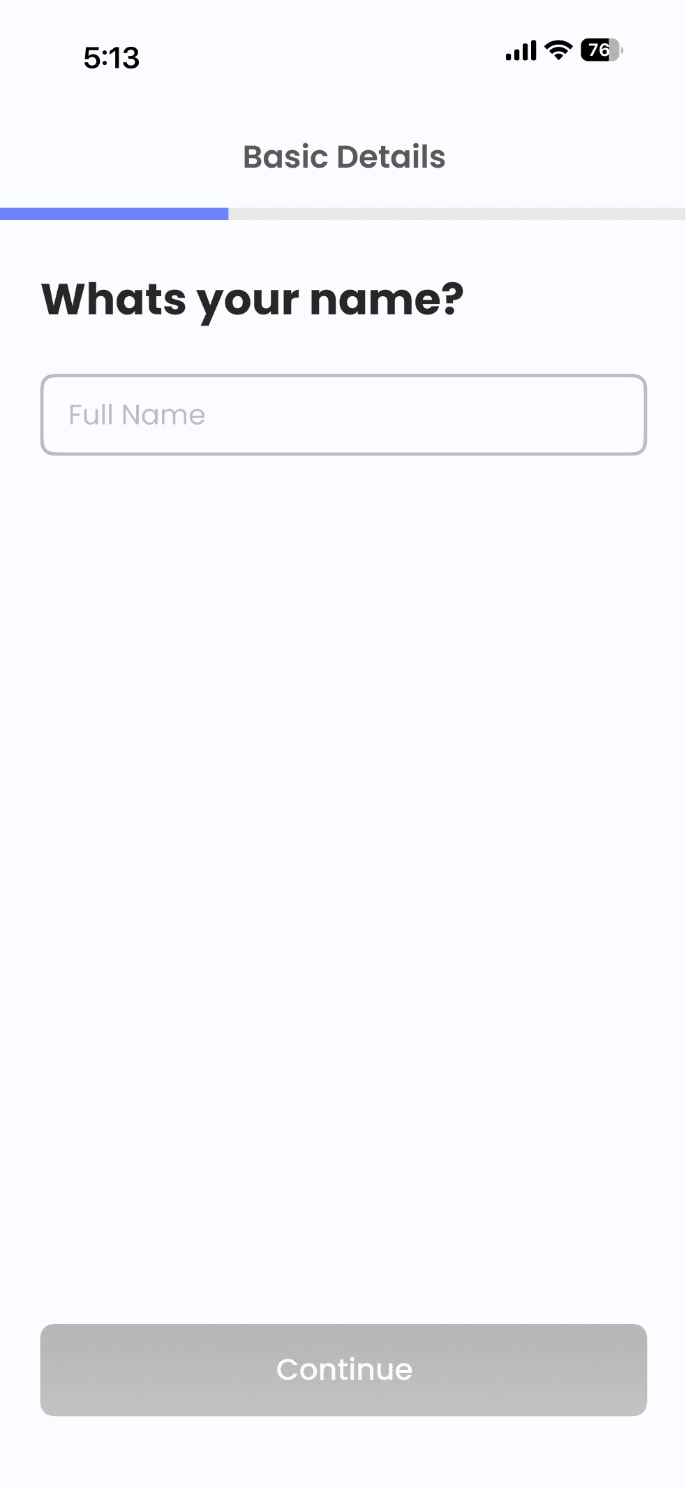
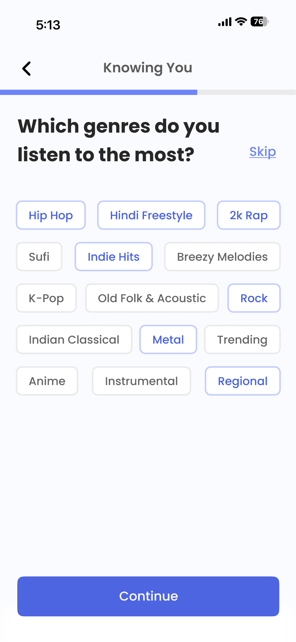
Onboarding Flow
Mood Analysis Screens
Splash Screen
SignUp/Login
Languages Selection
Flow ending if user decides to finish mood analysis
Flow ending if user decides to take the mood analysis manually everytime
Scrollable Top Artists Selection
Genre Interested Selection
Account Setup (Basic Details)
The mood analysis screen by
default is shown to the user
every time they open
the app to gauge their current
mood but,the user is also
given an option to skip this
and only enter their current
mood manually as per interest.
Zoom in for a better view !
And with that.. It’s a wrap. Thank you for your time ! ✨
